Lesson 5.1: Inference for One Mean or a Mean Difference from Two Paired Groups
Supplementary Notes 5.1
Simulating the Sampling Distribution of a Mean
On average, how much do BC post-secondary students owe?
Too much is the quick answer; however, statistically, the question asks us to estimate the mean student indebtedness,  , for the population of all BC students. When we take our sample, we will calculate the mean indebtedness for students in the sample,
  , and use it to estimate .
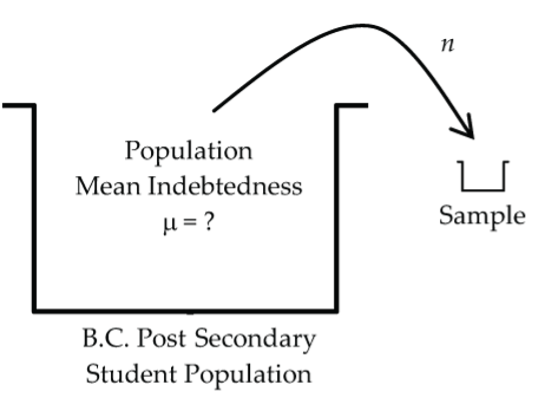
But, we know that the sample mean, , would fluctuate from sample to sample depending on which students are actually selected for the sample. To be able to answer questions relating to how accurately estimates , we need an answer to the same question that we posed and answered for sample proportions in Lesson 4.1.
As the sample mean varies from sample to sample, what pattern does it follow, where is it centred, and how much variability does it have?
Simulation Model
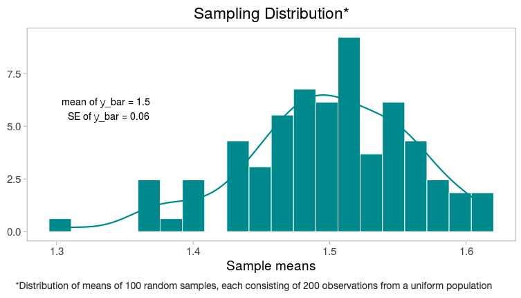
For simplicity, let’s suppose student debt is uniformly distributed between $0 and $3,000. For this simplified population model, the true (population) mean is  and the standard deviation is
  . Let’s use a sample size of n = 200 students. The first simulated sample based on this model produces
  , which is a little high in its estimate of .
Three more simulated samples of 200 students produce sample means of $1,550, $1,520, and $1,470. As expected, the sample means are fluctuating around the population mean of $1,500.
So, 100 simulated sample means fall between $1,280 and $1,630 and produce the following histogram, which approximates the sampling distribution for a mean.
Normal Model for the Sampling Distribution of a Mean
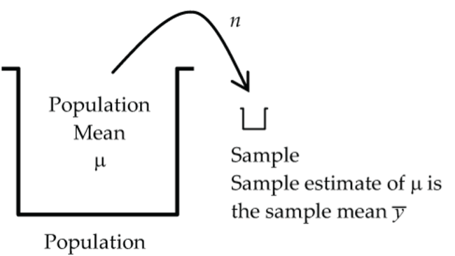
The development of the sampling distribution for a mean, , parallels very closely our earlier development of the sampling distribution for a proportion in Supplementary Notes 3.1. If we visualize taking all possible samples, fluctuates according to a probability distribution called a sampling distribution for . As with proportions, we’ll use the sampling distribution for to judge whether or not a particular value for is unusual.
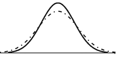
In general, the exact sampling distribution for is quite complex, but under some reasonable conditions, we can approximate it quite accurately with a normal model.
When we developed the sampling distribution for a proportion in Supplementary Notes 3.1, we introduced the central limit theorem (CLT), which stated that for large independent samples, the sampling distribution of the sample proportion,  , can be approximated by a normal model with mean,
  , and standard deviation,
  . The CLT can also be applied to the sampling distribution for a mean:
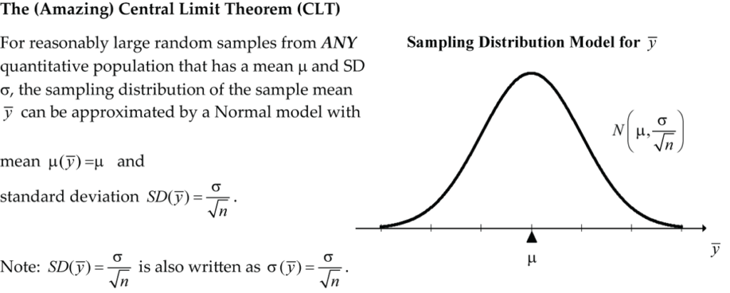

Recall from Supplementary Notes 3.1 that the standard deviation of a sample estimate based on its sampling distribution is called the standard error of the estimate. So, in this case, we say the standard error of the sample mean is  .
.
What’s so Amazing About the CLT?
The amazing thing is that no matter what the shape is for the distribution of the parent population, the shape of the sampling distribution of is approximately normal. In practical terms, we could be dealing with any numeric population (i.e., blood pressures, reaction times, temperatures, puppy weights, etc.) and the CLT says that the sample mean will fluctuate according to a normal model (approximately at least). The normal model tells us that on average the estimate will “hit” the target and that it will typically deviate from by  (which decreases as the sample size, n, increases). Equivalently,
  follows a standard normal model with mean 0 and standard deviation 1, written N(0, 1).
Problem! We typically don’t know  , the population standard deviation. Can we just use the sample standard deviation,
  , as an approximation for ? In other words, can we estimate the standard error of the sample mean by
  ?
?
Great idea, but it turns out that  does not follow a normal model.
What model can we use?
Student’s t-Models
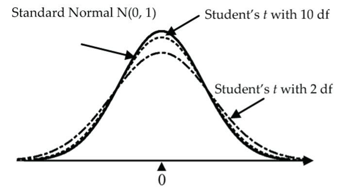
Working in quality control experiments in the early 1900s, a Guinness brewery worker named William Gosset discovered that the standardized sample mean, , didn’t quite follow the standard normal model, N(0, 1). Writing under the pseudonym Student, he derived a new probability model for called Student’s t-distribution that is very similar to the N(0, 1) curve but is somewhat flatter in the middle and wider (more probability in the tails). This extra probability in the tails compensates for our additional uncertainty that results from our replacement of the population SD, , by the sample SD, .
Degrees of Freedom
In fact, Student’s t-model isn’t just one curve, it’s a whole family of curves where each curve depends on a parameter called its degrees of freedom (df). For small degrees of freedom (like 2), the t-curve is much flatter than the N(0, 1) bell curve, but as the degrees of freedom increase, the t-curves get closer and closer to the N(0, 1) bell curve.
Student’s t-Model Conditions
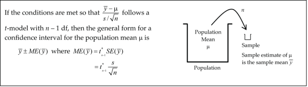
When the conditions below are met,  follows a Student’s t-model with n − 1 df.
Conditions:
- Independence: The individual responses in the sample are independent of each other.
- Random: The sample is random.
- 10% Condition: The sample size n is no more than 10% of the population size.
- Nearly Normal Condition: The data come from a population that is nearly normal. This condition is important for small data sets (say n < 30), but its importance wears-off as the sample size n increases (for n ≥ 30 we can essentially ignore the nearly normal condition as long as there are no particularly extreme outliers).
How to Check the Nearly Normal Condition?
The best way to confirm the nearly normal condition is to draw a graph of the data. Which graph? For very small data sets, the normal probability plot (Q–Q plot) from Supplementary Notes 2.3 is the best choice. For larger data sets, a histogram can be used; although the normal probability plot is still the best choice.
One-Sample t-Test for the Mean
Let’s explore this topic using examples.
Example: Oatmeal Raisin Cookies
A manufacturer of oatmeal raisin cookies advertises a mean fat content of 3 grams per cookie. The fat content (in grams) for a random sample of 12 cookies are: 3.2, 3.4, 3.7, 2.7, 2.8, 3.4, 3.0, 3.5, 3.2, 3.1, 3.6, and 2.9.
Download the data from cookie [CSV file] and open it in jamovi. Does this data provide sufficient evidence to conclude that the mean fat content, µ, for the population of all oatmeal raisin cookies is greater than the advertised 3.0 grams?
- H0: µ = 3.0 grams
- HA: µ > 3.0 grams
Model Conditions
- Independence: Reasonable to assume cookie-to-cookie fat content is independent as long as the random sample was drawn from different batches of cookies.
- Random: We are told in the question that the sample is random.
- 10% Condition: Since the cookie population size is essentially unlimited, the sample of 12 cookies is far less than 10% of the population size.
- Nearly Normal Condition: Is it plausible that the fat content measurements come from a normal model? Let’s investigate by drawing a normal probability plot in jamovi using
Analyses > Exploration > Descriptives.
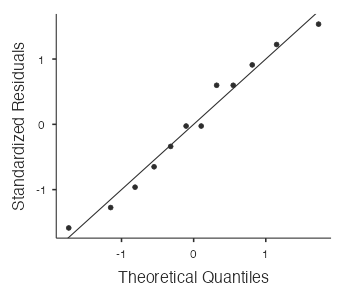
The points in the normal probability plot (Fig. 7) are quite close to the straight line and there are no outliers, so it is plausible that the fat contents come from a normal model.
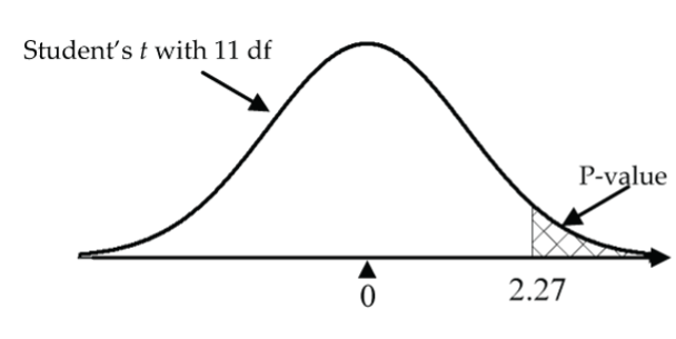
It’s now reasonable to proceed with the t-model for  with 12 − 1 = 11 df.
Mechanics
- Test Statistic Calculation:
 .
. - P-Value Calculation:
1 - pt(2.27, df=11)≈ 0.022.
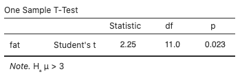
Alternatively, use jamovi’s built-in t-test by selecting Analyses > T-Tests > One Sample T-Test, move fat to the Dependent Variables box, type “3” for the Test value, and select “> Test value” for the (alternative) hypothesis. You can also view the normal probability plot by selecting “Q–Q Plot.” The test statistic value is 2.25 and the p-value is 0.023 (these values are more accurate than the previous hand calculations, which involved some rounding error):
Conclusion
With a p-value as small as 0.023, reject the null hypothesis in favour of the alternative hypothesis; i.e., there is evidence that the true mean fat content of the cookies is greater than the advertised 3.0 grams.
Alternatively, reject H0 in favour of HA if the test statistic is in the rejection region (either less than the negative critical value or greater than the positive critical value). Do not reject H0 if the test statistic is not in the rejection region (i.e., it is between the negative and positive critical values). The critical value in the cookies example is 2.2010, the 97.5th percentile of the t distribution with 11 degrees of freedom. Since the test statistic,  is greater than 2.2010, it is in the rejection region, so we reject H0 in favour of HA.
Example: Laser Eye Surgery
A laser eye surgery knife (microkeratome) is designed to cut a corneal flap with a mean flap thickness of 160 micrometres. The flap thicknesses (in micrometres) for a random sample of ten surgeries are: 156.4, 160.3, 162.7, 160.1, 156.8, 163.9, 157.6, 155.1, 162.2, and 151.3. Download the data from cornea [CSV file] and open it in jamovi.
Does this data provide sufficient evidence to conclude that the knife cuts a corneal flap with a mean population flap thickness, µ, different from 160 micrometres?
- H0: µ = 160 micrometres
- HA: µ ≠ 160 micrometres
Model Conditions
- Independence: No reason to doubt independence with information given.
- Random: We are told in the question that the sample is random.
- 10% Condition: Since the population size is essentially unlimited, the sample of 10 flap cuts is far less than 10% of the population size.
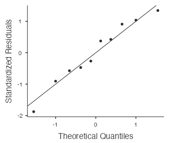
- Nearly Normal Condition: Is it plausible that the flap thickness measurements come from a normal model? Check by drawing a normal probability plot in jamovi when running the t-test (see below). The points in the normal probability plot below are quite close to the straight line and there are no outliers, so it is plausible that the flap thickness measurements come from a normal model.
It’s now reasonable to proceed with the t-model for  with 10 − 1 = 9 df.
Mechanics
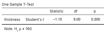
Use jamovi’s built-in t-test by selecting Analyses > T-Tests > One Sample T-Test, move thickness to the Dependent Variables box, type “160” for the Test value, and select “≠ Test value” for the (alternative) hypothesis. The test statistic value is –1.10 and the p-value is 0.300:
View the normal probability plot (Fig. 11) by selecting “Q–Q Plot:”
Conclusion
The p-value says that if the true mean flap thickness is 160 micrometres, samples of 10 flap cuts would produce an average as different from 160 as the observed sample mean about 30% of the time. Since this is not particularly unusual, there is not enough evidence to conclude that the mean thickness differs from 160 micrometres.
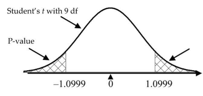
Alternatively, reject H0 in favour of HA if the test statistic is in the rejection region (either less than the negative critical value or greater than the positive critical value). Do not reject H0 if the test statistic is not in the rejection region (i.e., it is between the negative and positive critical values). The critical value in the laser eye surgery example is 2.2622, the 97.5th percentile of the t-distribution with nine degrees of freedom. Since the test statistic,  is between –2.2622 and 2.2622, it is not in the rejection region, so we do not reject H0.
One-Sample t-Interval for the Mean

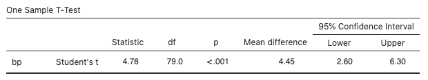
Example: Blood Pressure
A pharmaceutical company is conducting a preliminary study investigating the effect of a new drug on the blood pressure of heart patients. Download the data on 80 patients from bloodpressure [CSV file], and open it in jamovi.
Find a 95% confidence interval for the mean blood pressure increase for patients taking this drug.
Model Conditions
- Independence: The patient-to-patient BP increases were likely independent of each other.
- Random: The question does not state how the sample of 80 patients was selected. If the sample was taken as a convenience sample, we’ll note it as a concern.
- 10% Condition: Not a concern since the population of potential patients is very large.
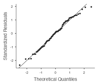
- Nearly Normal Condition: With a sample size as large as 80, the nearly normal condition is not really needed for the validity of the t-model (and the normal probability plot (Fig. 15) confirms there are no particularly extreme outliers).
Mechanics
- The sample of 80 patients produces a mean blood pressure increase of 4.45 mmHg with a standard deviation of 8.32 mmHg. So, the sample statistics needed to calculate the confidence interval are:
 ,
,  ,
,  .
. - For a 95% confidence interval we need 95% inside the interval, 2.5% below the interval, and 2.5% above the interval. So, the t-value we need is the one with 2.5% above it (and 97.5% below it). R code:
qt(0.975, df=79)≈ 1.9905. - 4.45 ± 1.9905(8.32/√80) = 4.45 ± 1.85 mmHg = (2.60, 6.30) mmHg.
- Alternatively, use jamovi’s built-in t-interval by selecting
Analyses > T-Tests > One Sample T-Test, movebpto theDependent Variablesbox, and select “Confidence interval” under “Mean difference.” The interval is (2.60, 6.30):
- View the normal probability plot (Fig. 15) by selecting “Q–Q Plot”:
While you are looking-up t-values, experiment with increasing the degrees of freedom (df). You should notice that they steadily get closer to the familiar 1.96 as the df increases. This is further confirmation that the t-model gets closer to the Normal model as the df increases.
Conclusion
We are 95% confident that the mean blood pressure increase for all patients taking the drug is between 2.6 and 6.3 mmHg.
Determining Sample Size for Desired Accuracy and Confidence
The margin of error in the last example was 1.85 mmHg based on a sample of 80 patients. Suppose that the researchers wanted to have a margin of error of only 0.75 mmHg in the estimation of the mean blood pressure increase at a 95% confidence level. How large a random sample is needed?
For estimating a mean, the margin of error is  , so let’s solve for sample size n.
- Square each side:

- Multiply each side by n:

- Divide each side by
 :
: 
For sample size calculations, always round up.
Problems!
We haven’t taken the sample yet, so we don’t have a value for s. How do we wriggle out of this one?
How do we get the value for t* when we don’t know the sample size n and therefore can’t find the df = n − 1?
We know that t-model values are very close to z-model values for large n, so let’s first calculate the sample size n by using z* to approximate t*. If this calculation produces a large n (say n > 60), we don’t need to adjust the calculation because z* and t* are very close. On the other hand, if this calculation produces a small n (say less than 60), we can use this value to find the corresponding t* and then recalculate the sample size using this t*.
In this question, we can use the sample standard deviation, s, from the previous example as a pilot study estimate, so s ≈ 8.32 mmHg. We also begin with z* = 1.96 (for a 95% CI) in place of t*:
 .
.
So, we need a random sample of about 473 (or more) patients to estimate the mean BP increase to within 0.75 mmHg at the 95% CI level.
In this example, there is no need to recalculate with a t* based on 473 – 1 = 472 df since the t* value is essentially equal to 1.96 (check it out using R—qt(0.975, df=472) ≈ 1.9650).
Paired Samples
Computers are great for doing the mechanics of a statistical analysis, but they are not so good at checking that the conditions for the analysis have been met, or even whether the chosen analysis is the right one for the job. That’s the job of the human!
Here we develop the paired t-analysis for the mean of the differences of paired measurements. Although there is absolutely nothing new to learn in the mechanics part of this analysis, you will have to think very carefully about how the data was collected so that you can make the all-important decision as to which of the paired vs. independent groups analysis is the right one for the job. We cover the paired analysis in this lesson and the independent groups analysis in Lesson 5.2.
Example: Mosquito Repellent Effectiveness
Careful, this example bites! Two mosquito repellents tested under laboratory conditions produced the data in Table 1. Is there sufficient evidence to conclude that the two repellents differ in their effectiveness?
| Repellent A | Repellent B |
| 7 | 4 |
| 13 | 13 |
| 9 | 10 |
| 13 | 8 |
| 7 | 5 |
| 9 | 11 |
| 14 | 13 |
| 9 | 7 |

The boxplots (Fig. 16) show that the distribution of bites for Repellent B is shifted lower somewhat from that of Repellent A, but is the difference statistically significant?
Without knowing more about how the data was collected, we have no way of determining whether to do a paired analysis (this lesson) or an independent groups analysis (Lesson 5.2). Here are two possible experimental scenarios that lead to different answers on this question (and ultimately lead to very different statistical analyses).
Scenario 1: Paired Groups
If only eight subjects were used and each person was tested with each of the two repellents (e.g., Repellent A on one arm and Repellent B on the other arm), then the data is paired and we analyze it with a paired t-test. Details to follow!
Scenario 2: Independent Groups
The groups are independent if 16 subjects had been randomly divided into two groups of eight; where one group of eight was assigned to Repellent A, and the other group of eight to Repellent B. Under this completely randomized experimental design, the two-sample t-test is appropriate (assuming the other conditions are met, see Lesson 5.2).
Example: Paired t-Test for the Mean Difference
For a random sample of eight subjects, one arm was treated with Repellent A and the other arm with Repellent B. Each arm was subjected to one minute in a mosquito-infested cage, and the number of bites was recorded on each arm. Do the data provide sufficient evidence to conclude that the two repellents differ in their “effectiveness?”
Download the data from mosquito [CSV file] and open it in jamovi. Create the “difference” variable by double-clicking the header in the first empty column in the data spreadsheet, select new computed variable, name the variable difference, and use the following formula: repellentA-repellentB.
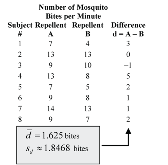
Confirm the sample mean and standard deviation by selecting Analyses > Exploration > Descriptives.
Although there are many ways that we could interpret repellent “effectiveness,” here’s how the paired t-test does the job. For each subject, the difference in the number of bites for each treatment is calculated as a first step. Then the paired t-test is based on the mean of the differences between the two treatments. We analyze the column of differences just like we did in the examples on oatmeal raisin cookies and laser eye surgery with a one-sample t‑test. The conditions of the test apply to the difference measurements and the calculations are done on the differences.
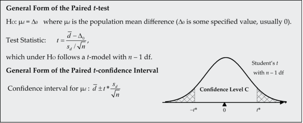

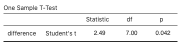
Is there a population mean difference in the number of bites?
- H0: µd = 0 bites
- HA: µd ≠ 0 bites
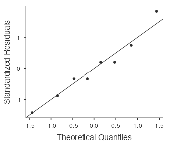
Model Conditions
- Independence: No reason to doubt subject-to-subject independence of the differences.
- Random: We are told in the question that the eight subjects were randomly selected.
- 10% Condition: No problem since the difference population is essentially unlimited in size.
- Nearly Normal Condition: Is it plausible that the differences come from a normal model? Check by drawing a normal probability plot in jamovi when running the t-test (see Fig. 20). The points in the normal probability plot below are quite close to the straight line and there are no outliers, so it is plausible that the differences come from a normal model.
It’s now reasonable to proceed with the t-model for  with 8 − 1 = 7 df.
Mechanics
Use jamovi’s built-in t-test by selecting Analyses > T-Tests > One Sample T-Test, move difference to the Dependent Variables box, type “0” for the Test value, and select “≠ Test value” for the (alternative) hypothesis. The test statistic value is 2.49 and the p-value is 0.042:
View the normal probability plot by selecting “Q–Q Plot:”
Alternatively, select Analyses > T-Tests > Paired Samples T-Test, move repellentA and repellentB to the Paired Variables box, and select “Measure 1 ≠ Measure 2” for the (alternative) hypothesis. the results are the same as above.
Conclusion
The p-value says that if the true mean difference in the number of bites were 0, samples of eight pairs would produce an average difference of 1.625 bites or more (in either direction) about 4.17% of the time. Since this is fairly unusual, there is evidence to conclude that the mean difference does differ from 0 and in fact is somewhat above 0. This leads us to the conclusion that, on average, use of Repellent B results in fewer bites and is more effective.
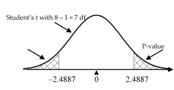
Alternatively, reject H0 in favour of HA if the test statistic is in the rejection region (either less than the negative critical value or greater than the positive critical value). Do not reject H0 if the test statistic is not in the rejection region (i.e., it is between the negative and positive critical values). The critical value in the mosquito repellent example is 2.3646, the 97.5th percentile of the t distribution with seven degrees of freedom. Since the test statistic,  is greater than 2.2010, it is in the rejection region, so we reject H0 in favour of HA.
The Paired t-Analysis
How do we know if the data is paired vs. independent?
It should be fairly obvious from the way in which the data is collected as to whether or not the data is paired. Here are some typical experimental situations where paired data occurs:
- Before and after measurements, or, more generally, two measurements on the same subject.
- Twin studies.
- Pairing of subjects at the start of a study based on criteria that researchers consider to be related to the variable of interest in the study. For example, in a study designed to compare the effectiveness of two exercise programs, subjects could be paired on the basis of their initial fitness levels.
The paired t-analysis is based on the differences of the paired measurements. The conditions required for this analysis are exactly the same as those required for the one-sample t-analysis, only now the conditions are imposed on the difference measurements.
Advantage of the Paired Design
The paired design is a special form of an experiment using blocking. Back in Supplementary Notes 1.2, we discussed blocking and noted then that the blocked design removes the variability due to differences between the blocks; thereby allowing us a clearer comparison of our treatment groups.
Think about how this applies to the mosquito repellent study. We know that people differ in their susceptibility to mosquito bites. Random assignment of 16 subjects to two independent repellent groups distributes this subject-to-subject variability over the two groups without bias. However, any difference in effectiveness of the two repellents is clouded somewhat by the subject‑to-subject variability in the subject’s susceptibility to mosquito bites. By conducting the experiment as a paired design, where each subject is tested with both repellents (i.e., each subject is a block), we essentially remove the mosquito bite variation due to differences in susceptibility and sharpen the focus on the difference in effectiveness between the two repellents.
Example: Paired t-Confidence Interval for the Mean Difference
Let’s begin this example with an excerpt from an article’s abstract that was published in the journal Clinical Biomechanics.
Hip, Knee, Ankle Kinematics and Kinetics During Stair Ascent and Descent in Healthy Young Individuals (Protopapadaki et al., 2006)
Background: Few studies have reported the biomechanical aspects of stair climbing for this ergonomically demanding task. The purpose of this ethically approved study was to identify normal functional parameters of the lower limb during stair climbing and to compare the actions of stair ascent and descent in young healthy individuals.
Methods: Thirty-three young healthy subjects, (16 M, 17 F, range 18–39 years) participated in the study. The laboratory staircase consisted of four steps (rise height 18 cm, tread length 28.5 cm)….
Findings: Paired-samples t-tests showed significantly greater hip and knee angles (mean difference: hip 28.10 degrees (SD 4.08), knee 3.39 degrees (SD 7.20)) (…) during stair ascent compared to descent. Significantly greater ankle dorsiflexion angles (9.90 degrees (SD 3.80)) and plantarflexion angles (8.78 degrees (SD 4.80)) were found during stair descent compared to ascent….
Interpretation: Stair ascent was shown to be the more demanding biomechanical task when compared to stair descent for healthy young subjects….
Note. Reprinted from Clinical Biomechanics, 22, Protopapadaki, A., Drechsler, W. I., Cramp, M. C., Coutts, F. J., & Scott, O. M., Hip, knee, ankle kinematics and kinetics during stair ascent and descent in healthy young individuals, 203–210, Copyright 2007, with permission from Elsevier.
This study was conducted as a paired design where stair ascent angles were compared to stair descent angles for each of 33 subjects at hip, knee, and ankle joints. In the Findings section of this study, the authors state that the paired t-test showed the mean knee angle was significantly greater during stair ascent compared to descent. A natural extension to this finding is a confidence interval estimate for this mean angle increase.
Model Conditions
The paired t-model conditions for the differences in angle measurements are likely met in this application (n = 33 subjects is sufficiently large that the nearly normal condition is not of great concern; however, we have no way of checking it since we are not given the individual measurements).
Calculations
For this sample of 33 difference measurements (ascent angle, descent angle) for the knee, we have  degrees and
  degrees. Using R,
 qt(0.975, 32) ≈ 2.037, from the t-distribution with 33 − 1 = 32 df. So, a 95% CI for the mean difference is:  degrees.
Conclusion
We are 95% confident that the angle for the knee is between 0.84 degrees and 5.94 degrees greater on average for stair ascent compared to stair descent.
References
Protopapadaki, A., Drechsler, W. I., Cramp, M. C., Coutts, F. J., & Scott, O. M. (2007). Hip, Knee, Ankle Kinematics And Kinetics During Stair Ascent And Descent In Healthy Young Individuals. Clinical Biomechanics, 22(2), 203-210. https://doi.org/10.1016/j.clinbiomech.2006.09.010
