Lesson 6.1: Linear Association Between Two Numerical Variables
Supplementary Notes 6.1
Investigating Possible Linear Relationships
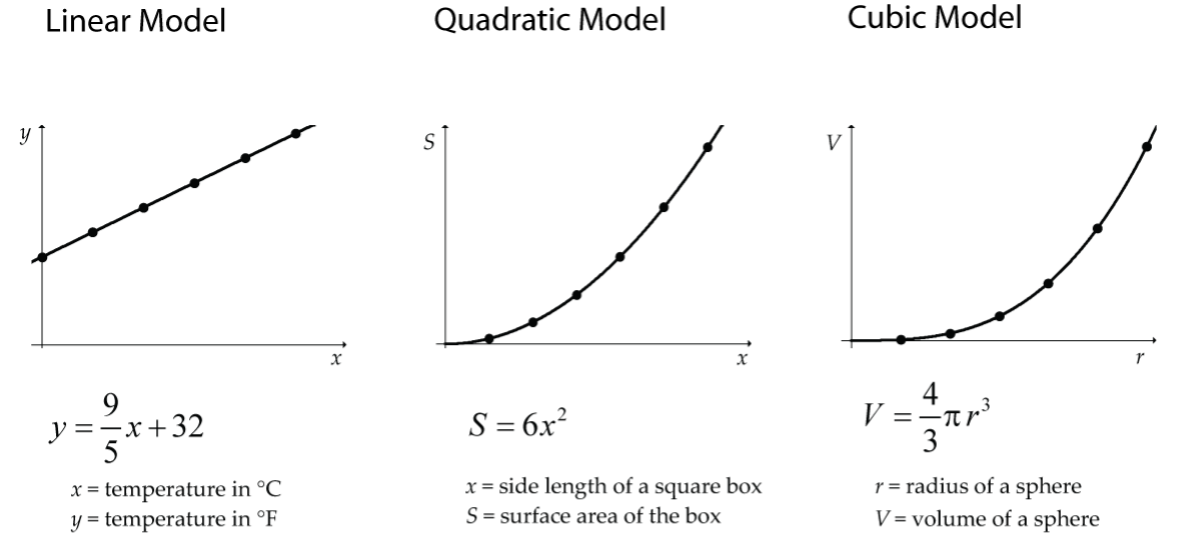
In a previous math course you likely worked with relationships between two numerical variables where the variables were perfectly related according to some model. Figure 1 has some examples you may be familiar with from a previous course:
In statistics, we investigate relationships where the underlying model is not at all clear, and the relationship (if there is one) is not perfect (but still useful!).
For example, what would the relationship look like for the following two variables?
- x = an adult’s age
- t = time for the person to run 10 km
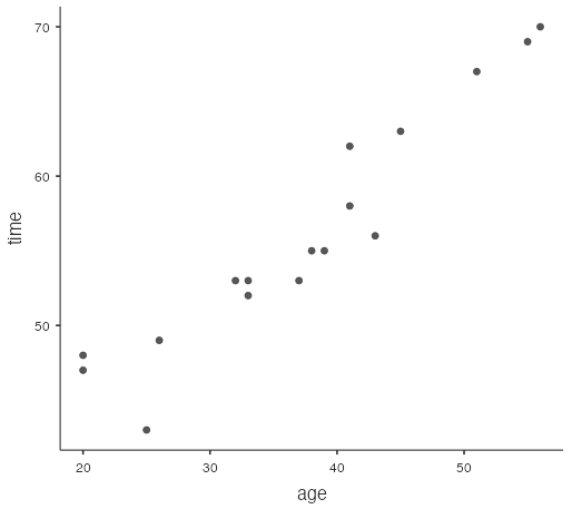
It would be a complicated relationship where many other variables (such as a person’s fitness level) come into play, but generally the older an adult, the longer it will take them to run 10 km. For a sample of adults, the plot of age and run time might look something like the graph below (Fig. 2). This type of graph is called a scatterplot.
Interpreting Scatterplots
Any investigation of a possible relationship between two numerical variables always begins with a scatterplot graph where one variable is assigned to the x-axis and the other to the y-axis.
What features are we looking for in a scatterplot graph?
- Direction
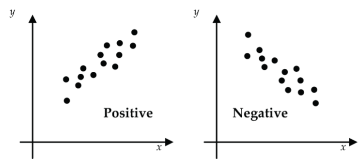
Figure 3: Scatterplot direction: (left) positive relationship, (right) negative relationship Is the scatter generally going up from lower-left to upper-right? If yes, then we say that there is a positive (increasing) relationship. If the scatter is generally going down from upper-left to lower-right, we say there is a negative (decreasing) relationship.
- Form
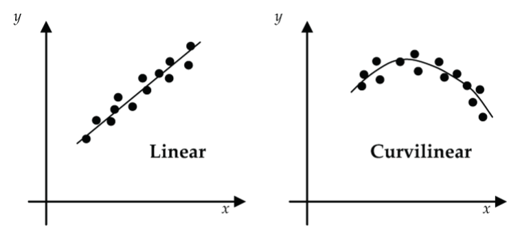
Figure 4: Scatterplot form: (left) linear, (right) curvilinear Does the relationship generally follow a linear trend, curvilinear trend, or no apparent trend?
- Strength
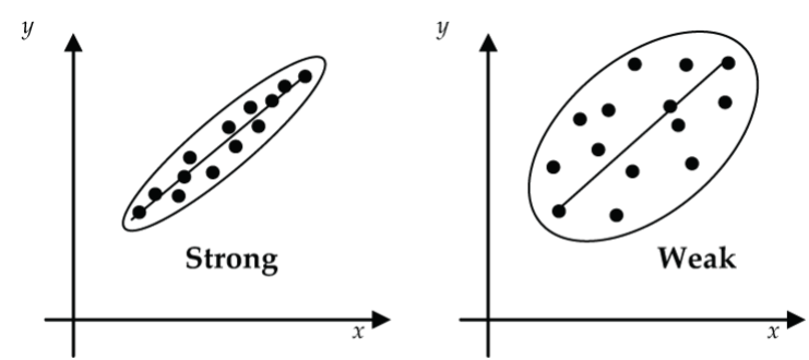
Figure 5: Scatterplot strength: (left) strong or close association to the trend line, (right) weak association to the trend line How strongly (tightly, closely) does the scatter follow the trend line?
- Unusual Features
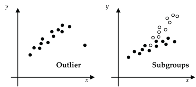
Figure 6: Unusual features of a scatterplot: (left) outlier data, (right) sub-groups in the data Are there any outliers, subgroups (e.g., male, female), or other unusual features?
Drawing Scatterplots Using jamovi
Table 1 shows the prices (in dollars) and ages (in years) of 16 used Toyota Corollas as listed in the classified section of a newspaper.
| Age, x | Price, y |
| 1 | 12,500 |
| 3 | 14,995 |
| 3 | 10,900 |
| 3 | 11,950 |
| 4 | 12,500 |
| 5 | 10,900 |
| 6 | 8,900 |
| 6 | 8,500 |
| 8 | 9,500 |
| 10 | 7,300 |
| 11 | 6,000 |
| 12 | 4,00 |
| 13 | 2,900 |
| 13 | 3,900 |
| 15 | 3,500 |
| 17 | 1,800 |
Notice that the variable “Age” is identified as the x-variable, and “Price” as the y-variable. Does it matter which you identify as x and y? Not really here, but it certainly will in Lesson 6.2.
Here’s how you decide. If you have the situation where you might want to predict values of one variable from values of the other variable, then you identify the x-variable as the one that you will use to make predictions from (the explanatory or predictor variable). The y-variable is the one that you are trying to predict values for, and it is called the response variable.
In the Toyota Corolla example, we want to predict price (y) from age (x). Recall from Software Lab 1.1 the steps to draw a scatterplot using jamovi.
- Download the data from corolla [CSV file] and open it in jamovi.
- Select the
Datatab and double-click the variable names in the headers to change the variable types fromNominaltoContinuous. - Select
Analyses > Exploration > scatr > Scatterplot. If you don’t see this menu item, then you don’t have thescatrmodule installed. Review Software Lab 1.1 to see how to install modules. - Move the variable
ageto theX-Axisbox andpriceto theY-Axisbox. The jamovi software draws a scatterplot withagealong the x-axis andpricealong the y-axis (Fig. 7).
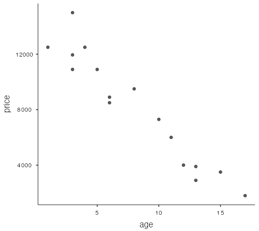
Features of this scatterplot:
- Direction: negative (decreasing)
- Form: reasonably linear (straight line)
- Strength: The association appears fairly strong since the scatter is tight.
- Unusual Features: None really; although the price for the one-year-old Corolla seems a little low.
Introducing the Correlation Coefficient
The issue now is: If a scatterplot suggests a linear relationship between two variables, how do we measure (quantify) the strength of that linear relationship?
A statistical measure called the correlation coefficient (denoted as r) has been designed to do the job. Before getting into calculating and interpreting the correlation coefficient, let’s identify the features that we would want in a statistic that is designed to measure the strength of a linear relationship.
- It should indicate whether the linear relationship is positive or negative.
- It should not depend on the units that we choose for our variables.
For example, x = age of infant could be measured in days, weeks, or months, and y = weight of infant could be measured in grams, kilograms, or pounds. We should get the same value for the linear strength measure regardless of what units are chosen for x and y. One way to remove the effect of units is to construct our measure of linear strength based on z-scores, which are unit-less. Here’s the construction in words:
- Convert each x-value and each y-value to z-scores, zx and zy.
- Multiply the corresponding z-scores for each of the n measurement pairs.
- Add up these n products.
- Divide by n − 1 to get the linear strength measure called the correlation coefficient (r). Note that the textbook denotes the correlation with an upper-case R. It is more common to use a lower-case r for the correlation, so we’ll stick with that here.
Pearson’s correlation coefficient,  , measures the strength of the linear relationship between x and y.
How Does the Correlation Coefficient Do Its Job?
It takes a more advanced course in statistics to truly understand how and why the correlation coefficient defined by measures the strength of the linear relationship between x and y. However, we can gain some insight into how r does its job by looking at some scatterplots where both x and y have been converted into z-scores.
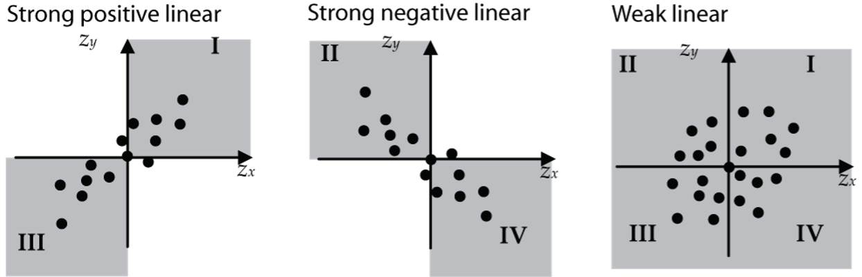
From the formula for r, we can see that r is essentially the average of all the  products (except that the divisor is n − 1 not n, for technical reasons). A strong positive linear relationship will have most of the points concentrated in quadrants I and III (shown in the upper-right and lower-left in Fig. 8). The product will be positive for all points in these two quadrants. For this type of scatter, the value of r will be close to +1.
A strong negative linear relationship will have most of the points concentrated in quadrants II and IV (upper-left and lower-right in Fig. 8). The product will be negative for all points in these two quadrants. For this type of scatter, the value of r will be close to –1.
Weak linear relationships will have the points somewhat evenly distributed in all four quadrants. The positive products of in quadrants I and III will be balanced by the negative products of in quadrants II and IV (Fig. 8). When these products are added up, they will give a value for r close to 0.
Calculating the Correlation Coefficient Using jamovi
Hand calculation of the correlation coefficient using the formula is very tedious and inefficient. In this course, you will not be asked to calculate r using this formula. However, it is essential that you know how to calculate r using statistical software like jamovi. Let’s use the Toyota Corolla data as an example. Hopefully you still have this data opened in jamovi.
- Select
Analyses > Regression > Correlation Matrix. - Move the variables
ageandpriceinto the right-hand box.
The jamovi software returns the value –0.956, which it labels “Pearson’s r.” What does an r value of approximately –0.956 tell us? For starters, since r is negative, it tells us that there is a negative linear relationship between Age and Price. This makes sense since the asking price generally goes down as the age of a Corolla goes up. Also, the linear relationship between Age and Price that was suggested by the scatterplot is strong because the value of r is close to –1.
Properties of the Correlation Coefficient
- The correlation coefficient (r) has no units and does not depend on the units used for x and y.
- The value of r does not depend on which of the variables you label x and which you label y.
- The correlation coefficient (r) is always a number between –1 and +1.
- The correlation coefficient (r) measures the strength of the linear relationship between two numerical variables.
- For r to be a valid and meaningful measure:
- The variables must be numerical.
- If there is an underlying relationship, it should be reasonably close to linear (as suggested by the scatterplot or by prior knowledge), not curvilinear.
- There should be no extreme outliers.
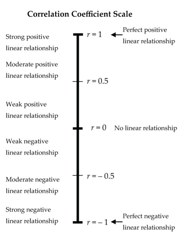
- The identification of “strong,” “moderate,” and “weak” on the correlation coefficient scale (Fig. 9) is intended simply as a guideline. It depends on the context whether a correlation like r = 0.6 is considered strong, moderate, or maybe even weak.
Correlation Coefficient Pitfalls
Correlation does not mean causation. Just because the two variables are correlated, you cannot automatically conclude that changes in one variable cause changes in the other variable. For example, in the summertime, the daily number of visitors to Vancouver’s beaches is positively correlated with the daily volume of water drawn from Vancouver’s reservoirs. Does that mean that high numbers of beachgoers cause high water demand on the reservoirs? Imagine a local politician proposing that we limit the number of beachgoers to conserve water supply. Obviously, high numbers of beachgoers do not cause high water demand. Rather, these variables are both responding to a third variable (called a lurking variable) that is causing the number of beachgoers and water demand to rise and fall together. In this example, the lurking variable is summertime daily high temperature: on warmer days, both beach visits and water usage tend to increase.
Correlation is not the same as association. Correlation is a technical term designed to measure the strength of the linear relationship between two numerical variables. An association (or relationship) between two variables is a more general concept. For example, two categorical variables can be associated, but not correlated (because correlation is defined only for numerical variables). Further, two numerical variables can be associated (or related) in many ways other than linear.
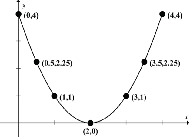
The scatterplot in Figure 10 clearly shows an association between x and y. But are x and y correlated? If you calculate the value of r (try it!), you will find that r = 0. It would be totally wrong to conclude that there is no association between x and y. Here the relationship is curvilinear (actually a perfect quadratic relationship), and we really shouldn’t even be calculating the correlation coefficient because correlation measures the strength of a linear relationship.
Correlation is sensitive to outliers. If an outlier is present, calculate r with and without the outlier. If r changes dramatically, report both values! (More on this in Lesson 6.2.)
Fitting a Straight Line to a Scatterplot
The correlation coefficient measures the strength of the linear relationship between x and y, but by itself it doesn’t help us to predict a value of y from a value of x. For example, predicting the price (y) of a 10-year-old Corolla (x = 10). To do that, we need to find the equation of a straight line fitted to the scatterplot of the data. We’ll discuss how to do that in Lesson 6.2, but to prepare we’ll first take a refresher on the equation of a straight line. Hopefully, the equation y = mx + b lurks somewhere deep in your mathematical memory. Remember:
- m = the slope of the line = rise/run
- b = the y-intercept of the line
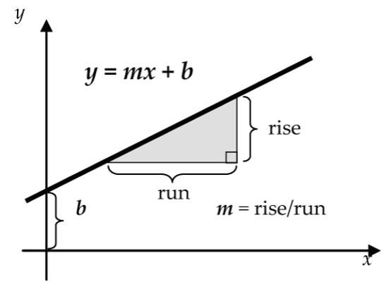
As we track the graph from left to right, the slope m tells how steeply the line is going up (m positive) or down (m negative). For example:
- m = 3 tells us that the line is rising three units vertically for each one unit of horizontal run.
- m = –2 tells us that the line is falling two units vertically for each one unit of horizontal run.
The y-intercept tells where the line intersects the y-axis when x = 0. For example:
- b = 4 tells us that the line intersects the y-axis at y = 4 units when x = 0.
- b = –1 tells us that the line intersects the y-axis at y = –1 unit when x = 0.
Examples: Straight Line Refreshers
Let’s start with y = 2x + 1: slope = 2, y-intercept = 1.
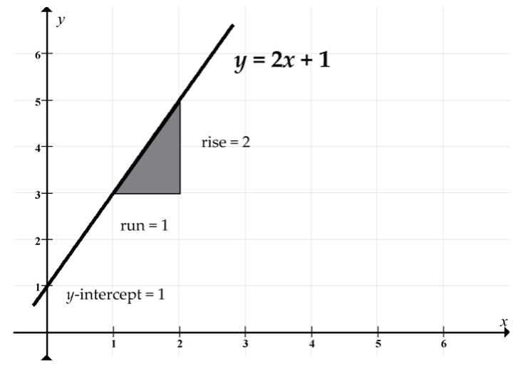
Prediction example: Our prediction of y when x = 2 is y = 2(2) + 1 = 4 + 1 = 5. Note how the line passes through the point (x, y) = (2, 5).
Next, let’s consider y = –x + 5: slope = –1, y-intercept = 5
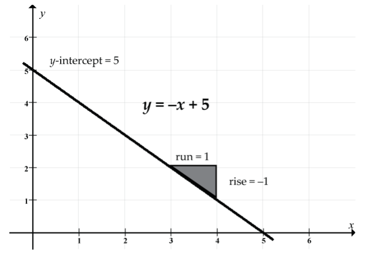
Prediction example: Our prediction of y when x = 2 is y = –2 + 5 = 3. Note how the line passes through the point (x, y) = (2, 3).
Let’s look at y = 4 − 0.5x: slope = –0.5, y-intercept = 4
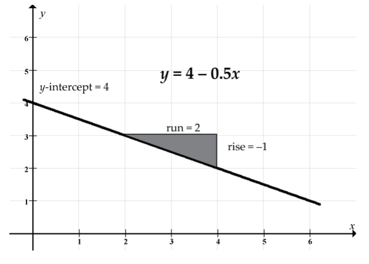
It doesn’t matter whether we write this equation as y = 4 − 0.5x or as y = –0.5x + 4.
Prediction example: Our prediction of y when x = 2 is y = 4 − 0.5(2) = 4 − 1 = 3. Note how the line passes through the point (x, y) = (2, 3).
