Lesson 6.2: Simple Linear Regression
Software Lab 6.2
Simple Linear Regression
This software lab is adapted from Simple Linear Regression (OpenIntro, n.d.-c) CC BY-SA 4.0 at OpenIntro Labs for jamovi.
The Human Freedom Index (hfi) is a report that attempts to summarize the idea of “freedom” through a bunch of different variables for many countries around the globe. It serves as a rough objective measure for the relationships between the different types of freedom—whether it’s political, religious, economic, or personal freedom—and other social and economic circumstances. The Human Freedom Index is an annually co-published report by the Cato Institute, the Fraser Institute, and the Liberales Institut at the Friedrich Naumann Foundation for Freedom.
In this lab, you’ll be analysing data from the Human Freedom Index reports. Your aim will be to summarize a few of the relationships, both graphically and numerically, within the data in order to find which variables can help tell a story about freedom.
As you work through the lab, answer the ungraded exercises in the shaded boxes. Check your answers by consulting the Software Lab 6.2 Solutions.
Remember to complete the graded Software Lab Questions for this section in Moodle.
Getting Started: The Data
Download hfi2016 [CSV file] (OpenIntro, n.d.-a), which contains data for 2016 from a larger dataset that contains information from Human Freedom Index reports from 2008–2016, and load the data into jamovi. Information on the larger dataset is available at Human Freedom Index (hfi) (OpenIntro, n.d.-b).
We’ll use the following variables for this lab:
pf_score: Personal Freedom (score): (0) worst – (10) best.pf_media_control: Political pressures and controls on media content: (0) low – (10) high.pf_security_safety: Security and safety: (0) worst – (10) best.
Data Exploration
Analyses > Exploration > Descriptives, move pf_score, pf_media_control, and pf_security_safety to the Variables box, and select Plots > Histogram.. Briefly summarize the variables numerically and describe the distributions of the variables. Check your answer by consulting the Software Lab 6.2 Solutions.Scatterplots
Analyses > Exploration > scatr > Scatterplot, move pf_media_control to the X-Axis box, and move pf_score to the Y-Axis box. Briefly describe the appearance of the scatterplot. Does there appear to be a linear or curvilinear relationship between the variables? Are there any points that stick out from the overall point cloud?Sum of Squared Residuals
Think back to the way that we described the distribution of a single variable. Recall that we discussed characteristics such as centre, spread, and shape. It’s also useful to be able to describe the relationship of two numerical variables, such as pf_score and pf_media_control above.
Just as we’ve used the mean and standard deviation to summarize a single variable, we can summarize the relationship between these two variables by finding the line that best follows their association.
Recall that the residuals are the difference between the observed values and the values predicted by the line:  . The most common way to do linear regression is to select the line that minimizes the sum of squared residuals. This produces the least squares regression line.
Analyses > Exploration > scatr > Scatterplot, move pf_media_control to the X-Axis box, move pf_score to the Y-Axis box, and select Linear under “Regression Line.” Briefly describe how the regression line summarizes the association between pf_score and pf_media_control.In the scatterplot in question 3, the residual for a point is given by the vertical distance between the y-value of a point and the  -value of the line.
Linear Regression Model
To find the equation of the least squares regression line in question 3, i.e. the line that minimizes the sum of squared residuals, we can use jamovi to fit the linear regression model. Click Regression, then Linear Regression. For the dependent variable, select pf_score and for covariates, select pf_media_control.
We’re first going to focus on the table with the title “Model Coefficients” (Fig. 1).
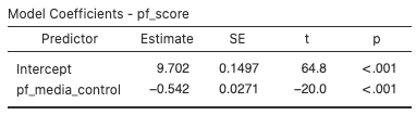
The “Estimate” column gives us the value of the linear model’s y-intercept and the coefficient of pf_media_control (i.e., the slope of the line). With these coefficients, we can write down the least squares regression line for the linear model:  .
.
This equation tells us two things:
- For countries with a
pf_media_controlof 0 (those with the least amount of political pressure on media content), we expect their mean personal freedom score to be 9.702. - For every one unit increase in
pf_media_control, we expect a country’s mean personal freedom score to decrease 0.542 units.
We can assess model fit using R2, the proportion of variability in the response variable that is explained by the explanatory variable. We can look in the first table in the linear regression analysis (Fig. 2) labeled “Model Fit Measures” for this information.
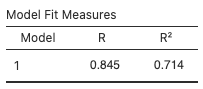
For this model, 71.4% of the variability in pf_score is explained by pf_media_control. Note that the use of the word “explained” here does not imply any causal link between the variables. We are merely quantifying an observed linear association between the variables.
Model Diagnostics
To assess whether the linear model is reliable, we need to check for: (1) linearity; (2) nearly normal residuals; and (3) constant variability.
Linearity: We’ve already checked if the relationship between pf_score and pf_media_control is linear using the scatterplot and regression line in questions 2 and 3. We should also verify this condition with a plot of the residuals vs. predictor values. Go back to the linear regression analysis (Fig. 2), and open the “Assumption Checks” sub-menu. Check the Residual plots box and look at the plots that are created. We will focus on the third one, “Residuals vs pf_media_control.”
Nearly normal residuals: To check this condition, we can look at a normal probability plot (Q–Q plot) to inspect the normality of the residuals. Check the “Q–Q plot of residuals” box to create this plot.
Constant variability:
pf_media_control” plot in question 4, does the constant variability condition appear to be violated? Why or why not?More Practice
Next, let’s consider the linear association between pf_score and pf_security_safety.
7. Select Analyses > Exploration > scatr > Scatterplot, move pf_security_safety to the X-Axis box, move pf_score to the Y-Axis box, and select Linear under “Regression Line.” Briefly describe the appearance of the scatterplot and how the regression line summarizes the association between pf_score and pf_security_safety.
Analyses > Regression > Linear Regression, move pf_score to the Dependent Variable box, and move pf_security_safety to the Covariates box. Write down the equation of the least squares regression line.pf_score is explained by pf_security_safety?pf_media_control or pf_security_safety, should produce more accurate predictions of pf_score, on average? Use your answers to the previous questions to explain your answer.References
OpenIntro. (n.d.-a). Data sets [Data sets]. https://openintro.org/data/
OpenIntro. (n.d.-b). Human freedom index. https://www.openintro.org/data/index.php?data=hfi
OpenIntro. (n.d.-c) CC BY-SA 4.0. Simple linear regression. OpenIntro Labs for jamovi. https://openintrostat.github.io/oilabs-jamovi/08_simple_regression/simple_regression.html
