Lesson 1.1 Organizing Data
Software Lab 1.1
Introduction to jamovi
This software lab is adapted from the Introduction to jamovi (OpenIntro, n.d.-b) CC BY-SA 4.0 lab at OpenIntro Labs for jamovi.
The jamovi Interface
The goal of this lab is to introduce you to jamovi, which is a free and open-source software for conducting statistical analysis. You will use the software throughout the course to learn statistical concepts, analyze real data, and come to informed conclusions.
As you work through the lab, answer the ungraded exercises in the shaded boxes. Check your answers by consulting the Software Lab 1.1 Solutions.
Remember to complete the graded Software Lab Questions for this section in Moodle.
As the software labs progress in the course, you are encouraged to explore beyond what the lab instructions dictate. A willingness to experiment will make you a much better data analyst! Before we get to that stage, however, you need to build some basic fluency with jamovi. First, we will explore the fundamental building blocks of jamovi, reading in data, and basic commands for working with data in jamovi.
Download jamovi. Once at the site, click jamovi Desktop: Download and install jamovi onto your computer near the top of the screen, then select the correct version for your computer.
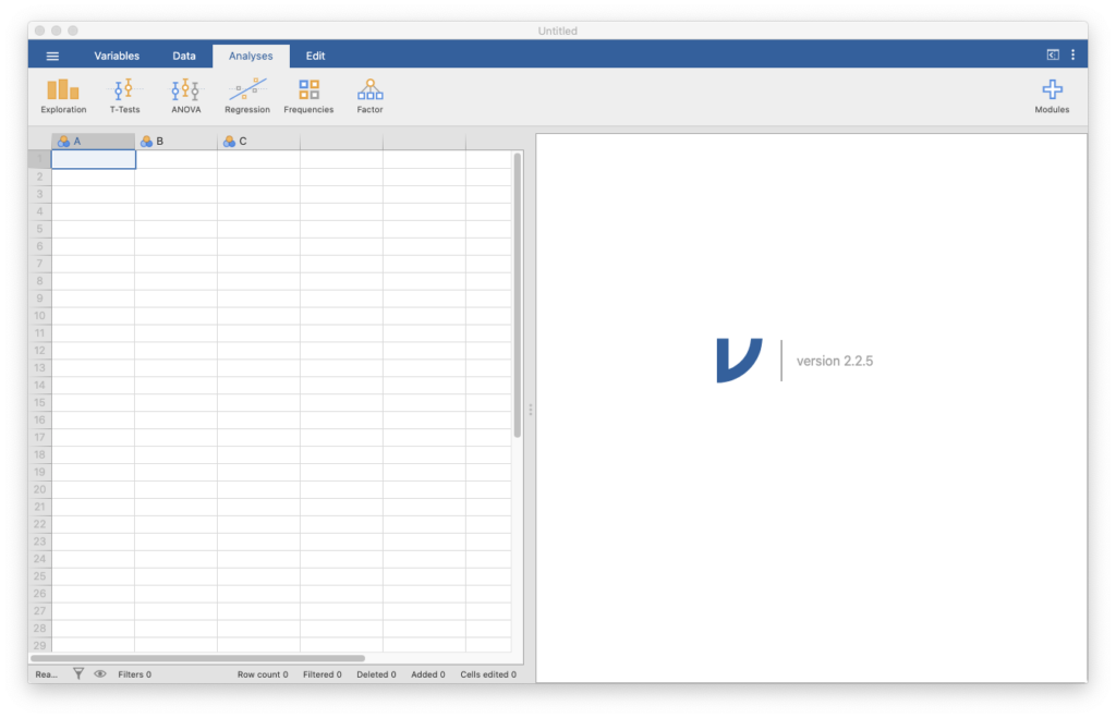
Once you have downloaded and installed the jamovi software, go ahead and launch jamovi. You should see a window that looks like the image in Figure 1.
Loading Data
First we’re going to download a dataset in a CSV (comma-separated values) file.
To download the file to your computer, click arbuthnot [CSV file] (OpenIntro, n.d.-a).
save file as or save link as in order to download the file instead of viewing it, depending on your computer’s operating system and web browser.Make sure to note where you download it, since you’ll need to go to that location to load it. Data sets for the software labs are linked directly in this Pressbook, but additional data sets are available for download at the OpenIntro (n.d.-a) Data Sets site.
To load the data, click the menu button (with the three horizontal lines) at the top-left part of the window, then select Open, then Browse, and select the CSV file in the location you downloaded it to. You will see a new window open with a display of the data, which should look like this:
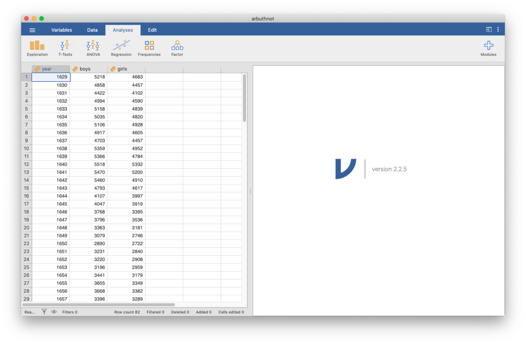
You’ll see three columns, one for each variable in the data. This display should feel similar to viewing data in Excel, where we can scroll through the dataset to inspect it. We can double-click the data to change any data that needs fixing, but we don’t need to do that here.
Dr. Arbuthnot’s Baptism Records
Let’s take a peek at the data. The Arbuthnot data set refers to the work of Dr. John Arbuthnot, an 18th century physician, writer, and mathematician. He was interested in the ratio of newborn boys to newborn girls, so he gathered the baptism records for children born in London for every year from 1629 to 1710.
When inspecting the data, you should see three columns of numbers and 82 rows. Thus, there are 82 observations and 3 variables in this dataset. The variable names are year, boys, and girls. Each row represents a different year that Arbuthnot collected data. There is also a column to the left of the variables which shows a row number. The first variable is the year, and the second and third are the numbers of boys and girls baptized that year, respectively. Use the scrollbar on the right side of the window to examine the complete data set.
Note that the row numbers are not part of Arbuthnot’s data. The jamovi software adds these row numbers as part of its printout to help you make visual comparisons. You can think of them as the index that you see on the left side of a spreadsheet. In fact, the comparison of the data to a spreadsheet will generally be helpful.
Types of Variables
Just to the left of the name of each variable, you should see an icon of a ruler. If you double-click the variable name, you will see options for the variable. This allows you to specify whether jamovi should interpret the variable as a continuous, ordinal, or nominal variable (or an ID). The jamovi software will try to select the correct type when it loads the data. Leave these variables as continuous. You can click the upward pointed arrow button to close this menu.
Some Exploration
Let’s start to examine the data a little more closely. Click the Exploration button near the top of the window, then click Descriptives. You will see the list of variables in one box. Move the variable boys to the box labeled Variables to see some descriptive statistics for that variable. You can move the variable over by clicking and dragging the variable name, or by clicking the variable name and then clicking the arrow between the boxes pointed at the Variables box.
You will then see the results in the right-hand side of the window. You should see that there are 82 valid observations, no data is missing, and you will see various other descriptive statistics for that variable. You can add an additional variable to the Variables box, and you will then see descriptives for each variable in the box. Do this with girls to see how the two variables compare.
girls? Are any values missing? Check your answers by consulting the Software Lab 1.1 Solutions.Creating a jamovi File
Now that you have some analysis, you should save your file in case you want to come back to it. With jamovi, you can save a .omv file which contains your data and all of your analysis, along with any descriptions you write in yourself. Open the menu (the three horizontal lines in the top-left corner), select Save As and you can save your first jamovi file to your computer.
Data Visualization
In order to create a scatterplot in jamovi, you’ll need to use a module, which extends the capabilities of jamovi. Click the plus button at the top-right part of the screen, select jamovi library, then click INSTALL in the first option, then scatr.
The module will now be installed in jamovi.
Note:
- You only need to do this once, as the module will be available now whenever you open jamovi.
- If this module is already installed, it will say
INSTALLEDand you are good to go. - If a future software update renders the module incompatible, you may need to uninstall the module and install it again. Do this from the “Manage installed modules” dialog.
Click the up arrow to close the modules menu. When you click Exploration again, there will be new options. Click Scatterplot in the Exploration menu.
To create a simple plot of the number of girls baptized per year, start by selecting the variables that you are interested in. Move the variable year to the X-Axis box and girls to the Y-Axis box (either by clicking and dragging or by using the arrow buttons). You will immediately see the scatterplot in the right panel.
The jamovi software allows for a number of features to be added to the scatter plot. Turn on a density plot or a boxplot for each variable using the radio buttons below Marginals, or add regression lines using the radio buttons below Regression Line.
2. Use the plot to address the following question: Is there an apparent trend in the number of girls baptized over the years? How would you describe it? Check your answers in the Software Lab 1.1 Solutions.
Analysis Options
Within your results, you can change the names of sections and add comments. Double-click the word Descriptives above your table of results, and you can change this to another name. By clicking below this name, you can add comments, and you can add comments by clicking below the table. By clicking the different sections of your analysis, you can bring up the menu of each section. By adding text, you can make a comprehensive document of all of your statistical work.
Next, by right-clicking on an analysis, you can duplicate an analysis in case you want to run two similar analyses.
Adding a New Variable to the Data Frame
We are interested in using a new vector of the total number of baptisms to generate some plots, so you will need to add it as a column in our data.
Close the analysis view (by clicking the right arrow) to go back to viewing the data. Double-click the header (where the name of a variable would be) in the fourth column, where you will create the new variable. This will bring up a menu: click NEW COMPUTED VARIABLE.
Change the name of the variable to total, then click the button labeled  . This will bring up a menu for us to enter the formula for the new variable.
You can click the name of a variable to include it in the formula. In formula, enter boys+girls. You’ll see that there is now a new column called total that has been tacked onto the data.
3. Create a scatterplot of the total number of baptisms (Y-axis) per year (X-axis).
In a similar fashion, once you know the total number of baptisms for boys and girls, you can compute the ratio of the number of boys to the number of girls baptized.
boy_to_girl_ratio given by boys/girls. What was the boy_to_girl_ratio in 1661?You can also compute the proportion of baptisms that are boys.
boy_ratio to the dataset by dividing boys by total. Notice that rather than dividing by boys+girls you are using the total variable you created earlier in our calculations! What was the boy_ratio in 1661?Finally, in addition to simple mathematical operators like subtraction and division, you can ask jamovi to make comparisons like greater than, >, less than, <, and equality, ==.
For example, create a new variable called boy_ratio_gt52 that tells us whether the proportion of boy baptisms was greater than 0.52 each year. To do this, create a new variable, name it boy_ratio_gt52 and enter boy_ratio then the greater than sign (>) then 0.52. Click Compute column, and you will see a column with true and false.
Exploration button, then click Descriptives, and move the new variable boy_ratio_gt52 to the box labeled Variables. Then check the Frequency tables option. In how many years was the proportion of boy baptisms greater than 0.52? Check your answers in the Software Lab 1.1 Solutions. More Practice
So far in this lab, we recreated some of the displays and preliminary analysis of Arbuthnot’s baptism data. The final part of this lab involves repeating these steps, but for present day birth records in the United States. The data are stored in a dataset called present, which you can download from present [CSV file] (OpenIntro, n.d.-a). You may need to right-click or control-click then select save file as or save link as in order to download the file. Be sure to note where you download the file on your computer.
The data come from reports (Mathews & Hamilton, 2005) published by the Centers for Disease Control. You can learn more at Present: US Birth Records (OpenIntro, n.d.-c).
Once you have downloaded the present dataset, open the menu (the three horizontal lines in the top-left corner), select Open, then Browse, and select the file in the location you downloaded it to.
Then do the following ungraded exercises. Check your answers in the Software Lab 1.1 Solutions.
Long Descriptions
- Figure 1 Screenshot of the Jamovi Interface which has four distinct areas. There is a top menu bar that gives access to the different portions of the program. From left to right in this menu is a “hamburger” icon (3 horizontal lines), Variables, Data Analyses, Edit then on the very far right side of window are two icons. The first icon encountered, a small screen icon, shifts the display area from a split of data and output to full output. The second icon, 3 vertical dots, opens up a small settings panel for adjusting output options. Immediately below menu bar is a context sensitive options ribbon. The ribbon contents change if Variables, Data, Analyses or Edit is selected on menu bar. The hamburger icon does not change this bar instead an option area slides out from the left side of the window. Below the context sensitive ribbon is the main display area of the program. On the left side is a series of columns for displaying variables and the data cases are displayed in successive numbered rows. On the right side is a white space where results from analysis are displayed. A fuller description of program is provided in the Jamovi User-Manual. [Back to Figure 1]
- Figure 2 Screenshot of the Jamovi interface once the once the Arbuthnot data file has been loaded. In the data view side of the window, three columns of data appear labelled: year, boys, girls. Along the bottom edge of the screen under the data is a row summarizing the status of the data showing Ready, Filters 0, Row count 82, Filtered 0, Deleted 0 added 0 and cells edited 0. There is also a filter icon that when clicked opens filter settings in an expandable section above the data. To the right of the Filter icon is an eye icon. If the data has filters applied, then clicking eye icon reveals a filter column immediately to left of data. [Back to Figure 2]
Media Attributions
Figure 1 The jamovi Interface (OpenIntro, n.d.) CC BY-SA 4.0
Figure 2 Loading Data in jamovi (OpenIntro, n.d.) CC BY-SA 4.0
References
Mathews, M. S., & Hamilton, B. E. (2005, June 14). Trend analysis of the sex ration at birth in the United States (National Vital Statistics Reports Series 53, Issue 20). Centers for Disease Control and Prevention. https://www.cdc.gov/nchs/data/nvsr/nvsr53/nvsr53_20.pdf
OpenIntro. (n.d.-a). Data sets [Data sets]. https://openintro.org/data/
OpenIntro. (n.d.-b) CC BY-SA 4.0. Introduction to jamovi. OpenIntro Labs for jamovi. https://openintrostat.github.io/oilabs-jamovi/01_intro_to_jamovi/intro_to_jamovi.html
OpenIntro. (n.d.-c). Present: US birth records. OpenIntro. https://www.openintro.org/book/statdata/index.php?data=present
