Lesson 1.1 Organizing Data
Software Lab 1.1 Solutions
- There are 82 valid observations for the
girlsvariable, and no data is missing. - The number of girls baptized fluctuated close to 5,000 in the 1630s, then trended down quite sharply in the 1640s and flattened out near 3,000 in the 1650s. It then trended up sharply in the 1660s and 1670s approaching 7,000, but then it increased less steeply in the 1680s and 1690s, and flattened out in the 1700s, fluctuating close to 7,500.
-
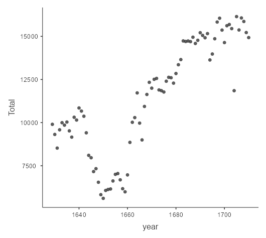
Figure 1: Output for question 3. Scatterplot of total number of baptisms (Y-axis) per year (X-axis) for the Arbuthnot dataset [Long Description] - 1.156.
- 0.536.
- The proportion of boys fluctuates quite widely from just over 0.5 to 0.536, but trends upwards slightly until the beginning of the 1660s. Then it trends downwards slightly to flatten out in the 1680s before starting to trend upwards again.
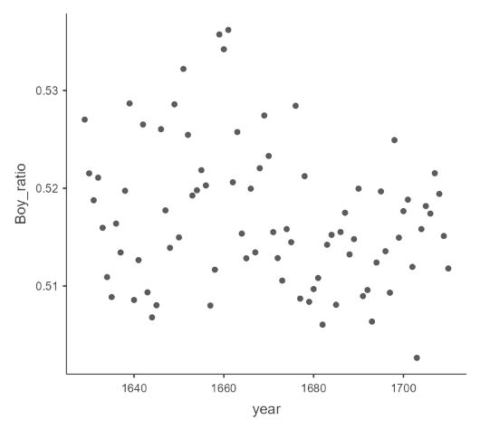
Figure 2: Scatterplot of proportion of boy baptisms (Y-axis) per Year (X-axis) for the Arbuthnot dataset. [Long Description] - 23.
- Years 1940–2002. Three variables: year, boys, girls. 63 observations.
- The counts are much larger, ranging from about 1.15 million to 2.19 million people (compared with 2,700 to 8,400 in Arbuthnot’s data).
- The proportion of boys fluctuates from about 0.511 to 0.514, but trends downwards from 1940 to the early 1960s. Then it trends upwards slightly to the lates 1970s before starting to trend downwards again. Dr. Arbuthnot’s observation about boys being born in greater proportion than girls does hold up in the U.S.
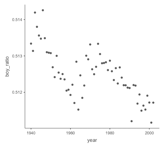
Figure 3: Scatterplot of proportion of boys (Y-axis) per Year (X-axis) for the Present dataset. [Long Description]
Long Descriptions
- Figure 1: Scatterplot output from Jamovi showing the year data (x-axis) plotted against the girl data for the Arbuthnot dataset. Going from the Y-axis (oldest year) to right (later years) the data shows the following pattern: a upward trend in point cluster with y-values from 4000 to 5000 as time passes. At approximately 1640 there is a sharp downtrend to below zero until approximately 1650 then is generally trends upward for rest of data. There is one noticeable outlier just after 1700 which is much lower in value, just under 6000 while other data in same time period is 7000 or higher. Generally, the data has limited spread and pattern is easily seen.[Back to Figure 1]
- Figure 2: Scatterplot output from Jamovi showing year data (x-axis) plotted against the calculated variable boy-ratio for Arbuthnot dataset. Overall trends described are difficult to pick out as there is a very wide spread of data. [Back to Figure 2]
- Figure 3: Scatterplot output from Jamovi showing year data (x-axis) plotted againted calculated variable boy-ratio for Present dataset. There is a steep drop off of values between 19040 and 1960 with ratio going from around 0.514 to less than 0.512. There is a general increase from 1960 to 1980 but with peak only getting to just above 0.513. The data values drop again between 1980 and 2000 with the ratio dropping well below 0.512. [Back to Figure 3]
