Lesson 1.4: Summarizing Categorical Data
Software Lab 1.4
Summarizing Categorical Data
This software lab is adapted from Introduction to Data (OpenIntro, n.d.-b) CC BY-SA 4.0 lab at OpenIntro Labs for jamovi.
In this lab we continue to explore the random sample of domestic flights that departed from the three major airports servicing New York City in 2013: EWR (Newark Liberty International Airport), JFK (John F. Kennedy International Airport), and LGA (LaGuardia Airport). We first looked at this dataset in Software Lab 1.3.
As you work through the lab, answer the ungraded exercises in the shaded boxes. Check your answers by consulting the Software Lab 1.4 Solutions.
Remember to complete the graded Software Lab Questions for this section in Moodle.
Getting Started
The Data
First, we’ll load the the nycflights dataset. Download the data nycflights [CSV file] (OpenIntro, n.d.-a), and load it into jamovi (click the three horizontal lines at the top left to reveal the menu then click Open).
Let’s think about some questions we might want to answer with these data:
- Which of the three major airports servicing New York (EWR, JFK, or LGA) has the best on time percentage for departing flights?
- Is an arrival more or less likely to be delayed if the departure has been delayed?
- How do average speeds differ by origin?
Analysis
On-Time Departure Rate for New York City Airports
Suppose you will be flying out of New York and want to know which of the three major airports has the best on-time departure rate of departing flights. Also suppose that for you, a flight that is delayed for less than 5 minutes is basically “on time.” You consider any flight delayed for 5 minutes of more to be “delayed”.
In order to determine which airport has the best on-time departure rate, you can first classify each flight as “on time” or “delayed”, then calculate the percentage of flights that are on time for each origin airport.
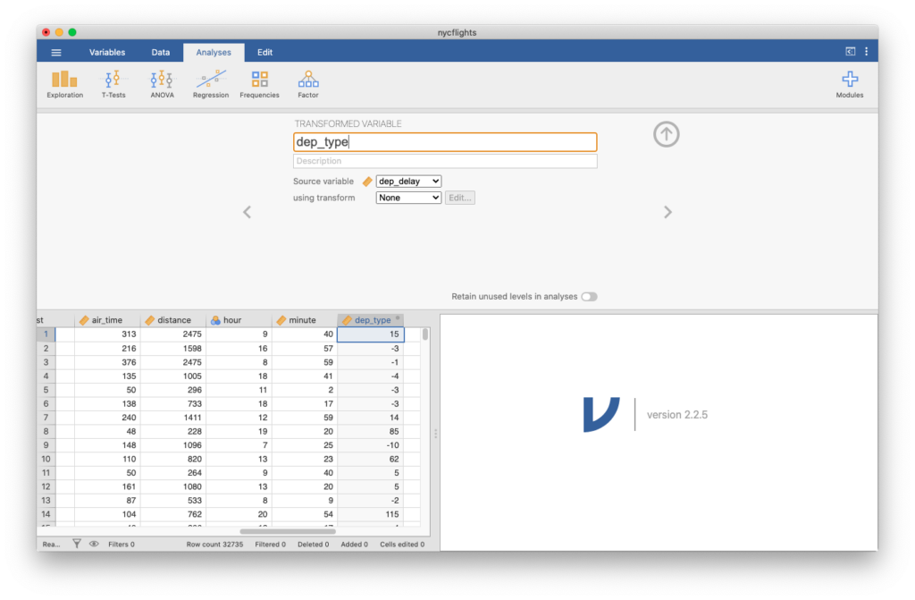
We’ll begin by making a new variable. Because this new variable is based on an existing one, click the Data tab, double-click the top of the first empty column where the variable name would be, and select NEW TRANSFORMED VARIABLE. Label this variable dep_type. For Source variable, select dep_delay.
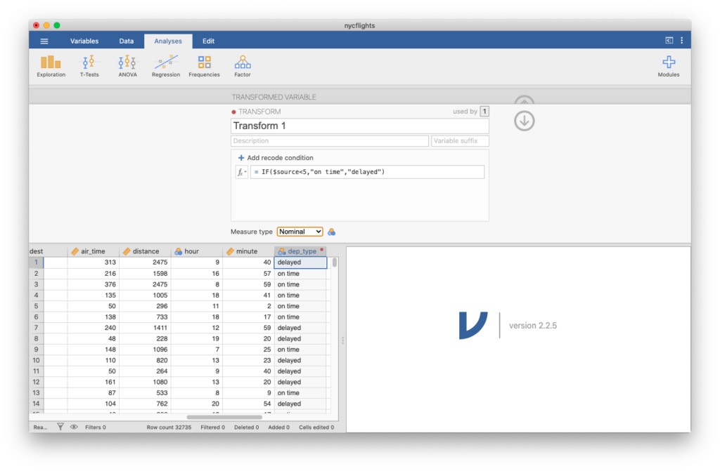
In using transform, click Create new transform. This would, in general, let you create transformation rules which you could use more than once. You’ll see  = $source
IF function to make the new column based on a condition in the source column (dep_delay).
After the equal sign, replace $source with IF(). (You could also find IF by scrolling down the menu after clicking IF function three things:
- what condition we want to use;
- what to do when the condition is satisfied; and,
- what to do when the condition is not satisfied.
Our condition is the original variable being less than three, or $source<5, so we can put that first inside the parentheses after IF. Next, when the variable is less than 5 (i.e., 5 minutes), we want to call that on-time, so type a comma, then "on time". Otherwise, we want to call it delayed, so type a comma, then "delayed". In other words, type the following after the equals sign: IF($source<5,"on time","delayed").
Hit enter, and the column will turn into a sequence of “delayed” and “on time.” If you look at the icon next to dep_type, you will see that jamovi is treating the variable as ordinal. This is fine, or you can force it to treat the variable as nominal by changing the value under Measure type for the transformation.
Contingency Tables
Next, click Analyses, Exploration, Descriptives, and create a table using the newly created variable dep_type and split by origin. Check the box Frequency tables and you will see a contingency table showing counts of how many flights were delayed or on-time from each airport. Table 1 shows the values you should see. The format of the table will differ from what is produced by jamovi.
| dep_type | Origin: EWR | Origin: JFK | Origin: LGA |
|---|---|---|---|
| delayed | 4273 | 3339 | 2739 |
| on time | 7498 | 7558 | 7328 |
| Note. EWR is Newark Liberty International Airport, JFK is John F. Kennedy International Airport, and LGA is LaGuardia Airport. | |||
Bar Plots
Check the box Bar plot under Plots and you will see a side-by-side bar plot of how many flights were delayed or on time from each airport.
On-Time Arrivals
Let’s now make a new variable to classify on-time arrivals based on arrival delays of less than 5 minutes. Click the Data tab, double-click the top of the first empty column where the variable name would be, and select NEW TRANSFORMED VARIABLE. Label this variable arr_type. For Source variable, select arr_delay. In using transform, click Transform 1, since we can re-use this transformation from before.
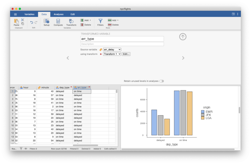
Next, click Analyses, Exploration, Descriptives, and create a table using the newly-created variable arr_type and split by dep_type. Check the box Frequency tables and you will see a contingency table showing counts of how many arrivals were delayed or on-time split by how many departures were delayed or on -time. Also, check the box Bar plot under Plots and you will see a side-by-side bar plot of how many arrivals were delayed or on-time split by how many departures were delayed or on-time.
Average Speed
Create a new average speed variable (in miles per hour or mph) by clicking the Data tab, double-clicking the top of the first empty column where the variable name would be, and selecting NEW COMPUTED VARIABLE. Name the variable avg_speed and define it as distance/(air_time/60). You’ll know you’ve done this correctly if avg_speed for the first flight is 474.441 mph.
Next, click Analyses, Exploration, Descriptives, and create summary statistics for each origin airport—EWR, JFK, and LGA—using the newly created variable avg_speed and split by origin.
Next, select Box plot under Plots and create side by side box plots for each origin airport.
The box plots show that the distributions of avg_speed for each origin are relatively symmetric but that there is a slight amount of skew. Left skew can be identified numerically by a mean that is less than the median or identified graphically by a box plot with outliers on the low end. Right skew can be identified numerically by a mean that is greater than the median or identified graphically by a box plot with outliers on the high end.
avg_speed for each origin slightly left skewed or slightly right skewed?Long Descriptions
- Figure 1: Jamovi screen shot showing the initial setup of the fields for creating a Transformed Variable called dep_type. No description entered. Source Variable is selected as dep_delay. Using transform field not yet set. As information is being filled in a new data column starts to be filled in. Data visualization side is empty. [Back to Figure 1]
- Figure 2: Jamovi screen shot showing the Transform screen of the Transformed Variable setup. The Transform is name Transform 1, no description provided, no variable suffix provided. A recode condition of = IF($source<5, “on time”, “delayed”) has been entered and the Measure type has been changed to Nominal. The dep_type data column is now shown with either delayed or on time for each row. Data visualization side is empty. [Back to Figure 2]
- Figure 3: Jamovi screen shot showing the initial setup of the fields for creating a Transformed Variable called arr_type. No description is provided. The source variable is arr_delay and the using transform has Transform 1 selected. A new data column called arr_type is now showing with either “delayed” or “on time” for each row. The data visualization side shows the bar graph created by the previous instructions. [Back to Figure 3]
References
OpenIntro. (n.d.-a). Data sets [Data sets]. https://openintro.org/data/
OpenIntro. (n.d.-b) CC BY-SA 4.0. Introduction to data. OpenIntro Labs for jamovi. https://openintrostat.github.io/oilabs-jamovi/02_intro_to_data/intro_to_data.html
