Lesson 1.4: Summarizing Categorical Data
Software Lab 1.4 Solutions
- EWR (Newark) had 7,498 on time departures out of 11,771 (63.7%), JFK had 7,558 on time departures out of 10,897 (69.4%), and LGA (LaGuardia) had 7,328 on time departures out of 10,067 (72.8%), so it appears best to fly out of LaGuardia.
- The bar plot supports the findings from part 1, as it shows the lowest count of delayed departures for LGA (LaGuardia), with on-time departures broadly similar for all three airports.
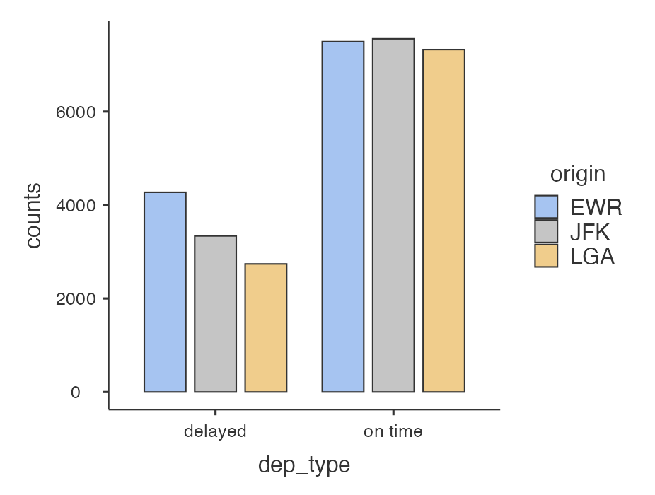
Figure 1: jamovi Bar plot of dep_type variable split by origin[Long Description] - There were 3,634 on-time departures that ended up delayed on arrival; whereas, only 2,460 delayed departures ended up on-time on arrival.
- Of 10,351 delayed departures, 7,891 (76.2%) were delayed arrivals too. Of 22,384 on-time departures, only 3,634 (16.2%) were delayed arrivals. This confirms that an arrival is more likely to be delayed if the departure is also delayed.
- JFK has the highest median average speed, 419 mph.
- LaGuardia (LGA) has the largest range: 627 mph (maximum 703 mph minus minimum 77 mph).
- JFK has the largest interquartile range (IQR): 103 mph (upper quartile 450 mph minus lower quartile 347 mph).
- The side-by-side box plots confirm the answers to exercises 5 (JFK has the highest centre line), 6 (LGA has the most extreme low and high points), and 7 (JFK has the widest box).
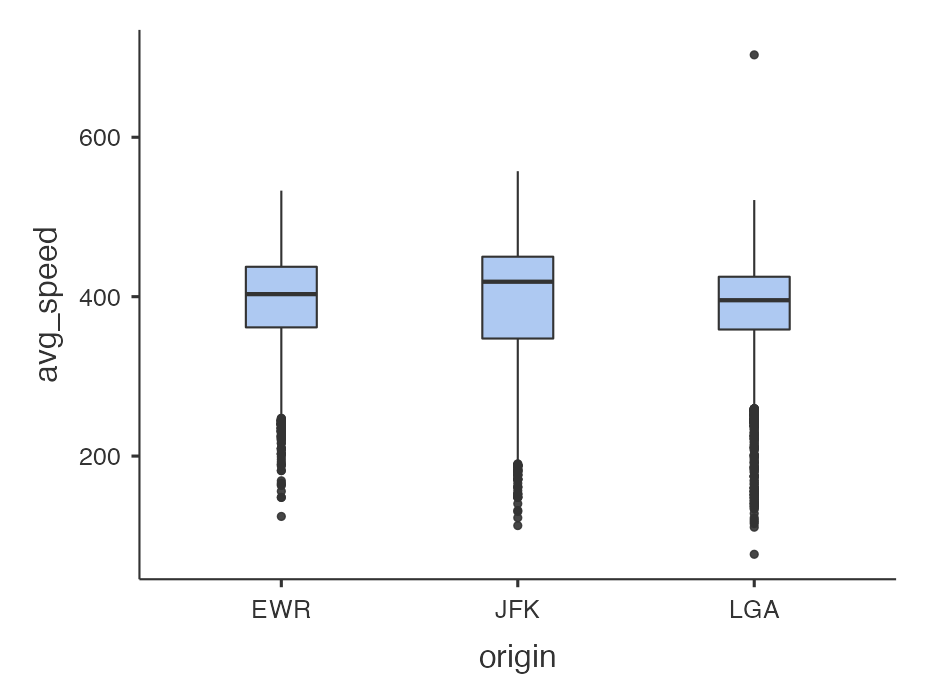
Figure 2: jamovi Box plots of avg_speed variable split by origin [Long Description] - The distributions of
avg_speedfor each origin are slightly left skewed. - LGA (LaGuardia) has an outlier on the high end (703 mph).
Long Descriptions
- Figure 1: Jamovi bar plot of the dep_type variable split out by Airport of origin. The X-axis has dep_type variable and the Y-Axis has counts. Along the X-axis there are two groups of bars. One set is for dep_type = delayed. EWR airport has highest value,with over 4000 counts, then JFK with approximately 3500 counts, then LGA with approximately 3000 counts. The second set is for dep_type = on time. JFK is very slightly higher than EWR. LGA is slightly lower than both. The counts for all are above the 6000 value on the Y-axis. [Back to Figure 1]
- Figure 2: Screen shot of Boxplots for Avg_speed split out by origin. There are three box plots in a row: EWR, JFK, and LGA. All show a median value close to 400. JFK shows the largest IQR then EWR then LGA. All have upper whiskers going to approximately 500. There is more variability shown in lower whiskers. LGA has shortest whisker but most outliers. EWR is slightly longer and has the next most outliers. JFK has the longest lower whisker but fewest outliers shown. [Back to Figure 2]
