Lesson 2.3: The Normal Distribution
Software Lab 2.3
The Normal Distribution
This software lab is adapted from the Normal Distribution lab (OpenIntro, n.d.-b) CC BY-SA 4.0.
As you work through the lab, answer the ungraded exercises in the shaded boxes. Check your answers by consulting the Software Lab 2.3 Solutions.
Remember to complete the graded Software Lab Questions for this section in Moodle.
The Data
In this lab we will be working with fast food data. This data set contains data on 515 menu items from some of the most popular fastfood restaurants worldwide. Download the data fastfood [CSV file] (OpenIntro, n.d.-a) and load it into jamovi. Let’s take a quick peek at the first few rows of the data.
You’ll see that for every observation there are 17 measurements, many of which are nutritional facts. You’ll be focusing on just two columns to get started: restaurant and calories from fat. Let’s first focus on just products from McDonald’s and Taco Bell.
The Normal Distribution
In your description of the distributions, did you use words like bell-shaped or normal? It’s tempting to say so when faced with a unimodal symmetric distribution.
To see how accurate that description is, you could imagine a normal distribution curve superimposed on the histogram. This normal curve should have the same mean and standard deviation as the data. If the data follow a normal distribution, the shapes of the histogram and the normal curve should be somewhat similar (i.e., symmetric and bell-shaped).
Evaluating the Normal Distribution
Eyeballing the shape of the histogram is one way to determine if the data appear to be nearly normally distributed, but it can be frustrating to decide just how close the histogram is to a normal curve. An alternative approach involves constructing a normal probability plot, also called a normal Q–Q plot for “quantile–quantile.”
Let’s focus on calories from fat from Taco Bell products, so first filter-out everything except for those products. Then, within the Exploration section, open the plots menu and check the Q-Q box to have jamovi generate the Q-Q plot for this data.
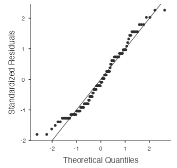
The x-axis values correspond to the quantiles of a theoretically normal curve with mean 0 and standard deviation 1 (i.e., the standard normal distribution). The y-axis values correspond to the quantiles of the standardized sample data (i.e., Z-scores). A data set that is nearly normal will result in a probability plot where the points closely follow a diagonal line. Any deviations from normality lead to relatively large deviations of these points from that line.
The plot for Taco Bell’s calories from fat shows points that tend to follow the line but with some errant points, especially towards the lower tail. You’re left with the same problem that we encountered with the histogram above: How close is close enough?
A useful way to address this question is to rephrase it as: What do probability plots look like for data that we know came from a normal distribution?
We can answer this by simulating data from a normal distribution. Note the mean and standard deviation from our cal_fat variable for Taco Bell, which are 188 and 84.8 respectively. We can make a new variable with the same mean and standard deviation, which does come from a normal distribution. To do this, make a new variable called sim_norm using the “New Computed Variable” option. For the formula, click the  menu, then scroll-down to the bottom to select
 NORM, which will sample from a normal distribution. Enter the mean and standard deviation in parentheses after NORM with a comma between them, i.e., NORM(188,84.8).
sim_norm variable. Do all of the points fall on the line? How does the normal probability plot for the real Taco Bell data compare to this plot?Even better than comparing the original plot to a single plot generated from a normal distribution is to compare it to more plots. Using the same method, create sim_norm2, sim_norm3, and so on, until you have a collection of variables which are all normally distributed.
Normal Probabilities
Okay, so now we have a few tools to judge whether or not a variable is normally distributed. Why should we care? It turns out that statisticians know a lot about the normal distribution. Once we decide that a random variable is approximately normal, we can answer all sorts of questions about that variable related to probability.
Adjust the data filter again to include only Taco Bell and consider the question: What is the probability that a randomly chosen Taco Bell product has more than 350 calories from fat?
To calculate this probability theoretically using the normal distribution, we will use the distrACTION module in jamovi. Click the plus button at the top-right part of the screen, select jamovi library, and add the distrACTION module to jamovi. When you do this, you will see a new distrACTION icon in the top bar.
If we assume that the calories from fat from Taco Bell’s menu are normally distributed (a very close approximation is also okay), we can find this probability by calculating a Z-score and consulting a normal probability table (e.g., Appendix C in OpenIntro Statistics [Diez et al., 2019] CC BY-SA 3.0). Alternatively, we can use jamovi to give us the probability directly by selecting Analyses > distrACTION > Normal Distribution and using the Compute probability function. Within this menu, make sure the mean and standard deviation are set to the mean and standard deviation of cal_fat for Taco Bell, then check the Compute probability box. Set x1 to 350 and select the second button (P(X  x1)). You should see the resulting probability “0.028” and a normal curve with an upper tail area shaded corresponding to this probability.
Alternatively, use the Rj - Editor to run R code inside jamovi module. Select Analyses > R > Rj Editor then copy and paste the following code into the Rj Editor window: 1 - pnorm(350, mean=188, sd=84.8). If you run this code, jamovi returns the answer of 0.02804.
Assuming a normal distribution has allowed us to calculate a theoretical probability, if we want to calculate the probability empirically we need to determine how many data observations fall above 350. Do this by creating a new computed variable named “cal_fat gt 350” that is 0 or 1 depending on whether cal_fat is greater than 350 (i.e., use IF(cal_fat>350,1,0) for the formula). Then find the mean of this new variable for Taco Bell products. You should find it is 0.0348.
Although the probabilities are not exactly the same, they are reasonably close. The closer that a distribution is to being normal, the more accurate the theoretical probabilities will be.
Normal Percentiles
We can also use the normal distribution to find the percentile associated with a particular probability. Recall that the 95th percentile of a distribution is the value such that 95% (or 0.95) of the distribution is less than this value. For example, consider the question: What is the value such that 95% of Taco Bell products have a lesser number of calories from fat?
If we assume that the calories from fat from Taco Bell’s menu are normally distributed (a very close approximation is also okay), we can find this percentile by consulting a normal probability table (e.g., Appendix C [Diez et al., 2019] CC BY-SA 3.0) and converting the resulting Z-score to a data value. Alternatively, we can use jamovi to give us the percentile directly by selecting Analyses > distrACTION > Normal Distribution and then using the Compute quantile(s) function. A quantile is the same as a percentile, just with the percentage expressed as a decimal. Within this menu, make sure the mean and standard deviation are set to the mean and standard deviation of cal_fat for Taco Bell, then check the Compute quantile(s) box. Set p to 0.95 and select the first button (cumulative quantile). You should see the resulting percentile “327” and a normal curve with the percentile marked. In other words, based on the normal distribution, 95% of Taco Bell products have less than 327 calories from fat. Thus, 5% of Taco Bell products have greater than 327 calories from fat.
Alternatively, use the Rj - Editor to run R code inside jamovi module. Select Analyses > R > Rj Editor then copy and paste the following code into the Rj Editor window: qnorm(0.95, mean=188, sd=84.8). If you run this code, jamovi returns the answer of 327.5.
References
Diez, D. M., Çetinkaya-Rundel, M., Barr, C. D. (2019). OpenIntro Statistics (4th ed.). OpenIntro. https://www.openintro.org/book/os/
OpenIntro. (n.d.-a). Data sets [Data sets]. https://openintro.org/data/
OpenIntro. (n.d.-b) CC BY-SA 4.0. Normal distribution. OpenIntro Labs for jamovi. https://openintrostat.github.io/oilabs-jamovi/04_normal_distribution/normal_distribution.html
