Lesson 1.3: Summarizing Numerical Data
Software Lab 1.3
Summarizing Numerical Data
This software lab is adapted from Introduction to Data (OpenIntro, n.d.-b) CC BY-SA 4.0 lab at OpenIntro Labs for jamovi.
Some define statistics as the field that focuses on turning information into knowledge. The first step in that process is to summarize and describe the raw information: the data. In this lab we explore flights, specifically a random sample of domestic flights that departed from the three major airports servicing New York City in 2013: airport codes EWR (Newark Liberty International Airport), JFK (John F. Kennedy International Airport), and LGA (LaGuardia Airport). We will generate simple graphical and numerical summaries of data on these flights and explore delay times. Since this is a large data set, along the way you’ll also learn the indispensable skills of data processing and subsetting.
As you work through the lab, answer the ungraded exercises in the shaded boxes. Check your answers by consulting the Software Lab 1.3 Solutions.
Remember to complete the graded Software Lab Questions for this section in Moodle.
Getting Started
The Data
The Bureau of Transportation Statistics (BTS, 2022) is a statistical agency that is a part of the Research and Innovative Technology Administration (RITA). As its name implies, BTS collects and makes transportation data available, such as the flights data we will be working with in this lab.
First, we’ll load the the nycflights dataset. Download the data from nycflights [CSV file] (OpenIntro, n.d.) and load it into jamovi (click the three horizontal lines at the top left to reveal the menu then click Open).
The data set nycflights that shows-up in your workspace is a data matrix, with each row representing an observation and each column representing a variable. We will refer to this data format as a data frame, which is a term that will be used throughout the labs. For this data set, each observation is a single flight.
The nycflights codebook (OpenIntro, n.d.-c) gives a description of the variables. One of the variables refers to the carrier (i.e., airline) of the flight, which is coded according to the following system: carrier is a two letter carrier abbreviation:
- 9E: Endeavor Air Inc.
- AA: American Airlines Inc.
- AS: Alaska Airlines Inc.
- B6: JetBlue Airways
- DL: Delta Air Lines Inc.
- EV: ExpressJet Airlines Inc.
- F9: Frontier Airlines Inc.
- FL: AirTran Airways Corporation
- HA: Hawaiian Airlines Inc.
- MQ: Envoy Air
- OO: SkyWest Airlines Inc.
- UA: United Air Lines Inc.
- US: US Airways Inc.
- VX: Virgin America
- WN: Southwest Airlines Co.
- YV: Mesa Airlines Inc.
The nycflights data frame is a massive trove of information. Let’s think about some questions we might want to answer with these data:
- How delayed were flights that were headed to Los Angeles?
- How do departure delays vary by month?
- Does average speed tend to be slower or faster for longer flights?
Analysis
Departure Delays
Let’s start by examining the distribution of departure delays of all flights with a histogram. Select Exploration, then Description, then move the variable dep_delay to the Variables box. Click Plots, then check the Histograms box.
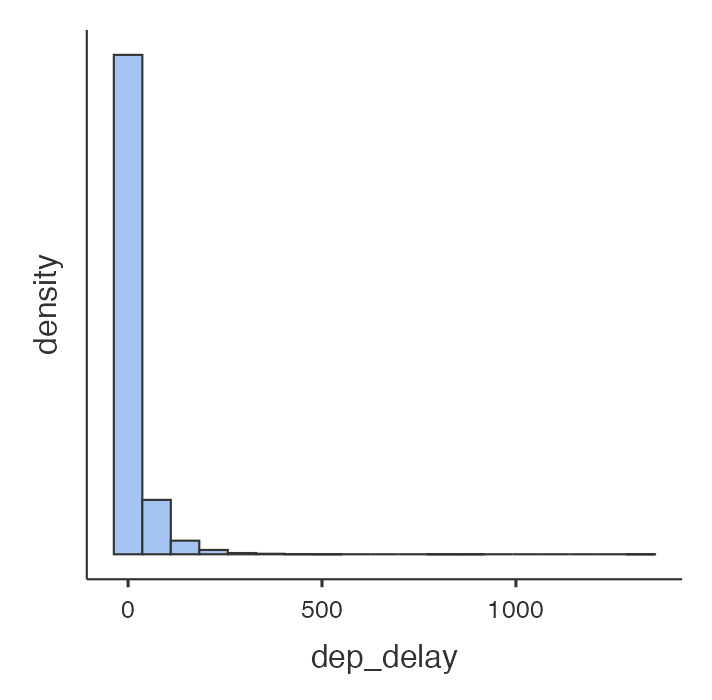
Histograms are generally a very good way to see the shape of a single distribution of numerical data, but that shape can change depending on how the data is split between the different bins. jamovi attempts to choose a reasonable number of bins. (They are working to allow the user to change the number of bins, though this feature is not available yet.)
To visualize only delays of flights headed to Los Angeles, we need to first filter the data for flights with that destination. To do this, click the data tab at the top of the window, where you will see an icon that looks like a funnel in the top bar. This brings up the filter menu, where we can apply conditions.
We want to only use arrivals where the destination is Los Angeles, so our condition is dest=="LAX". (LAX is the airport code for Los Angeles International Airport.) The two equal signs is a “test,” which determines whether the variable dest is equal to the value “LAX”, and anything other than that condition will be filtered out. You will then see parts of your data greyed out, leaving only the requested data.
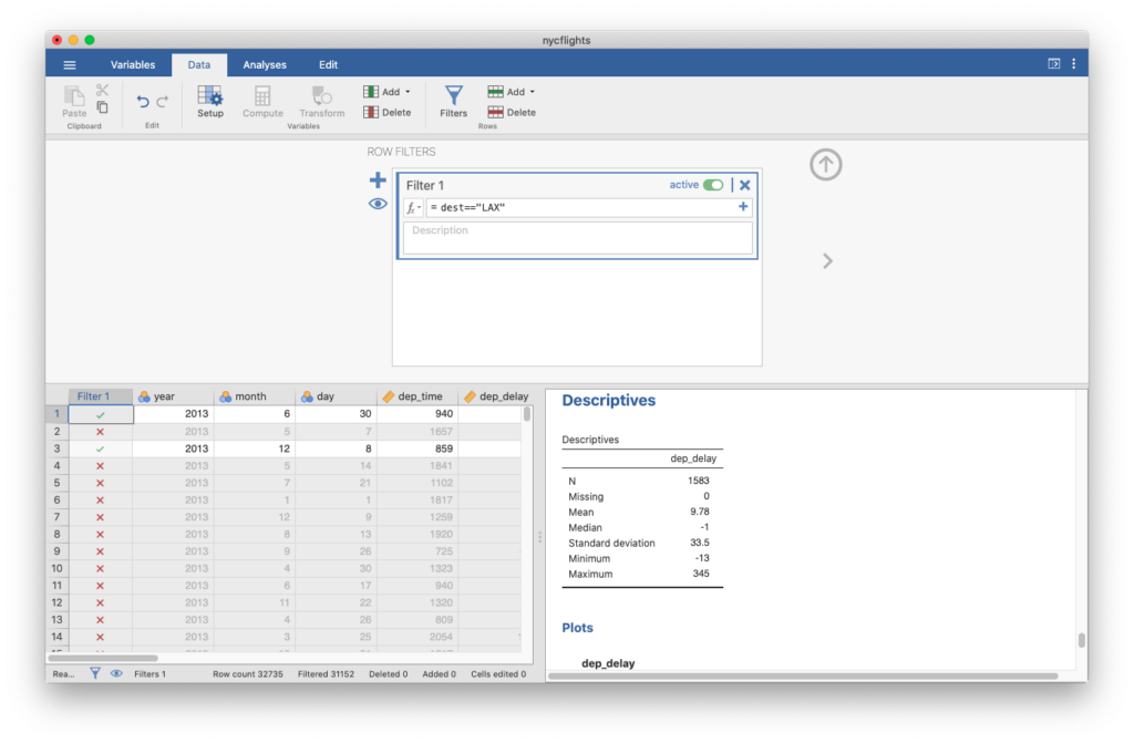
Go back to the Analyses tab to view the updated histogram of dep_delay and you will see that your histogram only uses the flights where the destination is Los Angeles.
We can also view numerical summaries for these flights in the Descriptives table, created by default when you select the dep_delay variable in the Descriptives menu.
We can also filter based on multiple criteria. Suppose we are interested in flights headed to San Francisco (airport code SFO) in February. Bring-up the filter menu again (click the Data tab to find it). We want the use only data that satisfies the conditions dest=="SFO" and month==2, which we can do by using a filter dest=="SFO" and month==2.

At the bottom of this view, you can see that there were originally 32,735 rows, and the filter has filtered out 32,667 of them. This means that there are 68 rows left after the filter has been applied (confirm this by observing N = 68 in the descriptives table).
We can create more complicated filters as well. If you are interested in either flights headed to SFO or flights in February, you can use the “or” operator. A formula of dest=="SFO" or month==2 will give this.
Departure Delays by Origin
Another useful technique is quickly calculating summary statistics for various groups in your data frame. We’ll go back to including all of our data, so you can either delete the filter or click the active switch on the created filter to make it inactive.
Go back to the Descriptives menu (click the Analyses tab then Exploration to find it). To get the summary stats departure delays for each origin airport, we can use dep_delay as our variable, and put origin in the Split by box.
Note that we could also select Histogram here (under Plots), and jamovi will create a histogram for each origin airport.
Statistics menu above the Plots menu within Descriptives. Check the IQR option in Dispersion to add these values to our table. Which origin has the most variable departure delays based on IQR (inter-quartile range, the range that includes the middle 50% of the values)?Departure Delays by Month
Which month would you expect to typically have the longest delays departing from an New York City airport?
Let’s think about how we could answer this question. We could get descriptive statistics for the departure delays using month as the split variable.
Average Speed
Create a new variable by clicking the Data tab, double-clicking the top of the first empty column where the variable name would be, and selecting NEW COMPUTED VARIABLE. Name the variable avg_speed and define it as the average speed (in mph) travelled by the plane for each flight . Average speed can be calculated as distance divided by number of hours of travel, but note that air_time is given in minutes. You’ll know you’ve done this correctly if avg_speed for the first flight is 474.441 mph.
avg_speed. Is the histogram approximately symmetric?avg_speed?avg_speed (Y-axis) vs. distance (X-axis). Describe the relationship between average speed and distance.Comparing Departure and Arrival Delays
10. Replicate the following plot and determine (roughly) what the cutoff point is for departure delays where you can still expect to get to your destination on time.
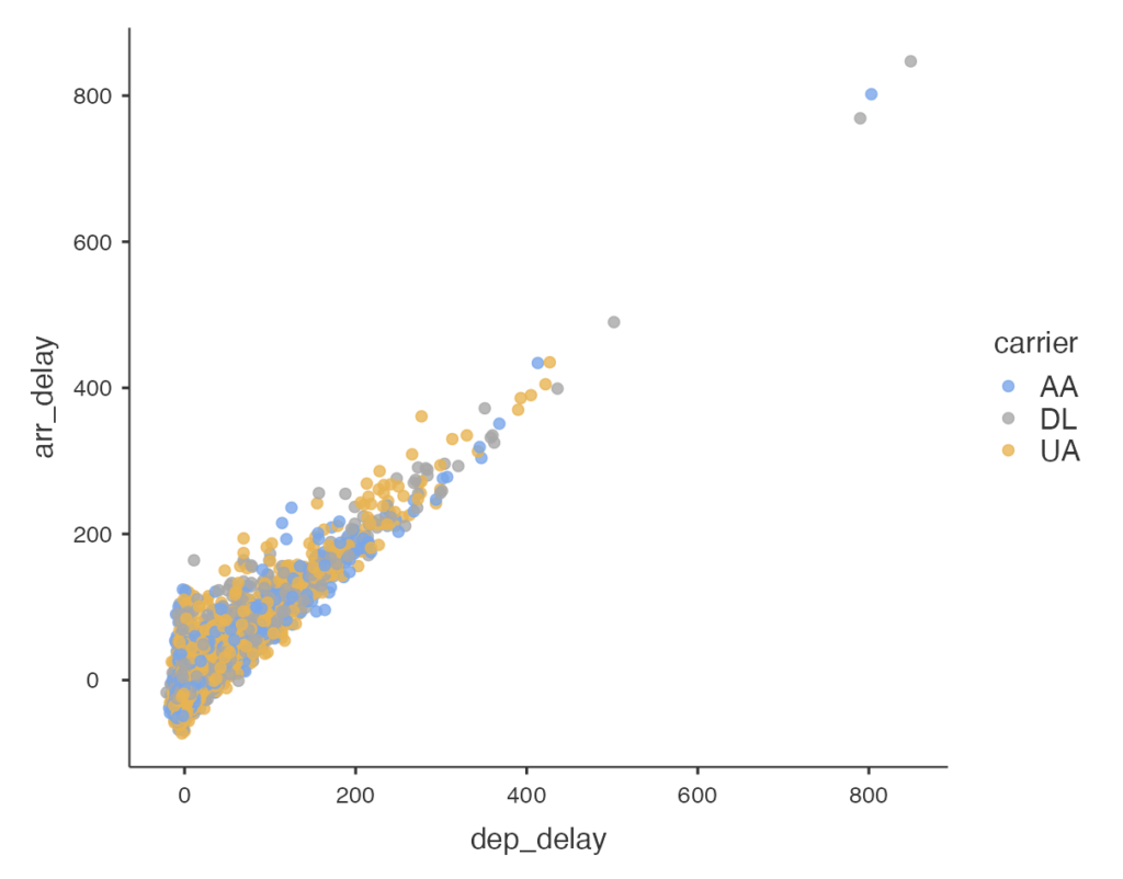
Hint: The data frame plotted only contains flights from American Airlines, Delta Airlines, and United Airlines. You can create a filter, and use “or” to select only flights that are from those airlines. You can string together multiple “or’s”.
Long Description
- Figure 1: Jamovi produced histogram of the dep_delay variable from the ny-cflights data set. Dep_delay is ploted along the X-axis with 0, 500, and 1000 labelled along axis. The y-axis is labelled Density and has no units. There are only 4 visible bars of data immediately to right of y-axis, none of which has direct label of category. The first bar extends almost to top of chart. The second bar is less than a tenth of the first bar’s size. The third bar is one fifth the size of the second bar and the fourth bar is about one quarter the size of the third bar. Overall, there is a strong reduction in height of bars. [Back to Figure 1]
- Figure 2: Jamovi screen shot showing the effect of clicking on the Data menu and then selecting Filters option from the options bar. An area opens up between the options bar and the data display area with the options for setting up “Row Filters”. The name given is Filter 1 and the options include defining the filter, describing filter, making filter active or deleting the filter. The filter definition shown is “dest==”LAX”. The data display area shows as a new first column labelled “Filter1” which shows green checkmarks for data rows included in filter and a red x for data rows excluded from the filter. The descriptives data table is updated to show the results for smaller data set. [Back to Figure 2]
- Figure 3: Jamovi screen shot of updated Filter 1 with filter condition of dest==”SFO” and month==2. The descriptives data table has again been updated to show the more limited dataset. [Back to Figure 3]
- Figure 4: Jamovi screen shot of a scatter plot with variable dep_delay on X-axis and arr_delay on Y-axis. X-axis scale is 0 to 800 by increments of 200 and Y-axis has scale 0 to 800 by increments 200. There is a legend with title carrier with three labelled dots. Blue dot for AA, grey dot for DL and yellow dot for UA. The plotted dots clump closely together following an approximately 45 degree line with no dots below the implied line and a spread of dots above. The majority of dots are have both X and Y values below 200. Close to 99% of the data have X and Y values below 400. There are 4 outliers with the most extreme 3 having X and Y values of 800 or slightly higher. [Back to Figure 4]
References
Bureau of Transportation Statistics [BTS]. (2022, Aug. 8). Learn about BTS and our work. https://www.bts.gov/learn-about-bts-and-our-work
OpenIntro. (n.d.-a). Data sets [Data sets]. https://openintro.org/data/
OpenIntro. (n.d.-b) CC BY-SA 4.0. Introduction to data. OpenIntro Labs for jamovi. https://openintrostat.github.io/oilabs-jamovi/02_intro_to_data/intro_to_data.html
OpenIntro. (n.d.-c). nycflights: Flights from New York City airports [Data set]. https://www.openintro.org/book/statdata/index.php?data=nycflights
