Lesson 1.3: Summarizing Numerical Data
Software Lab 1.3 Solutions
- 128 flights headed to LAX in March.
- The distribution of departure delays ranges from -10 to 164 minutes but is heavily skewed to the right with the majority of the data less than 15 minutes.
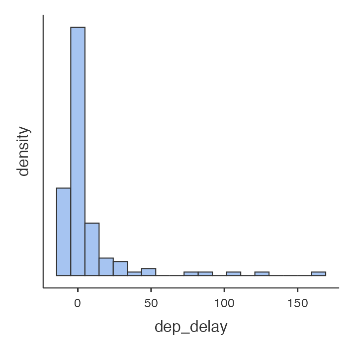
Figure 1: Histogram of dep_delay data [Long Description] - The mean departure delay is not very meaningful here since the distribution is so skewed.
- The box plot shows a median departure delay of -1.00 minutes, the middle 50% of delays between -4 and 4.25 minutes, the lower whisker extending to the minimum delay of -10 minutes, and the upper whisker extending to 4.25 + 1.5(8.25) = 16.625 minutes. There are a number of outliers with delays greater than 16.625 minutes.
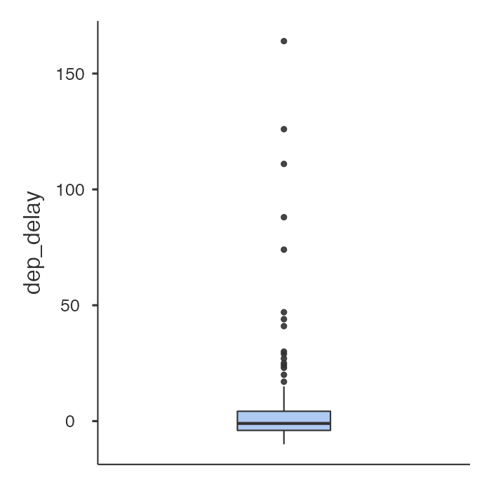
Figure 2: Jamovi Box plot of dep_delay variable [Long Description] - EWR (Newark) has an IQR of 19.0 minutes, compared with 15.0 minutes for JFK and 13.0 minutes for LGA (LaGuardia).
- Since the distribution of departure delays is heavily skewed to the right, the median is more appropriate than the mean. September and October both have the minimum median departure delay of -3.00 minutes.
- The histogram of
avg_speedis approximately symmetric.
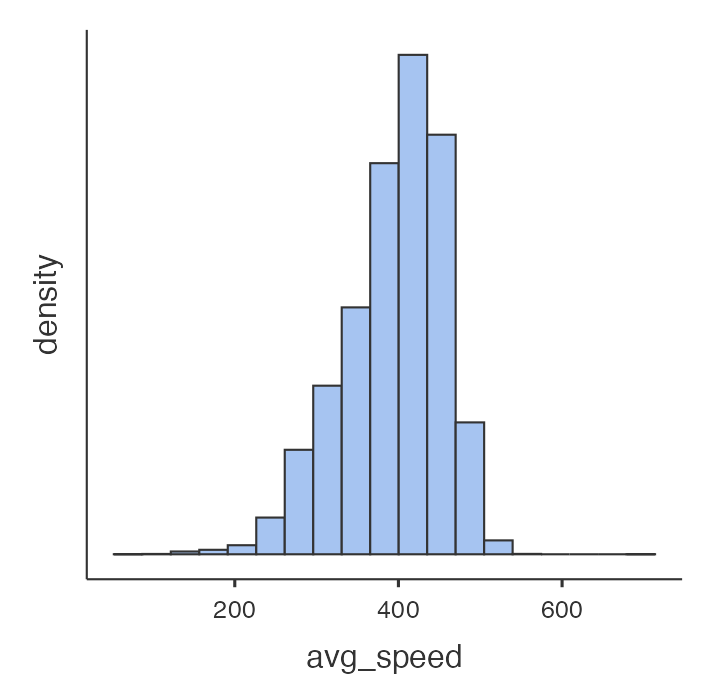
Figure 3: jamovi Histogram of avg_speed variable [Long Description] - The mean of
avg_speedis 394 mph and the standard deviation ofavg_speedis 60.8 mph. - There is a nonlinear relationship with
avg_speedtending to increase with distances steeply up to about 500 miles, less steeply from 500 to 100 miles, less steeply again from 1,000 to 1,500 miles, and then reaching a plateau for longer distances. There is an outlier with a distance of about 800 miles and an average speed of just over 700 mph.
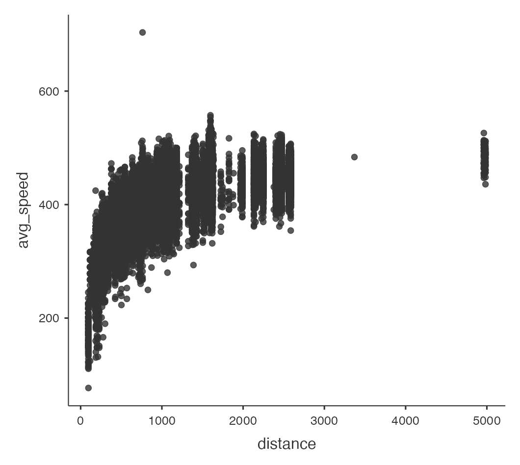
Figure 4: jamovi Scatterplot of avg_speed vs. distance - The filter required is
carrier=="AA" or carrier=="DL" or carrier=="UA". The cutoff point for departure delays where you can still expect to get to your destination on time is approximately 70 minutes. Obtain this by eyeballing that a horizontal line wherearr_delay= 0 has a maximum value fordep_delayof about 70 minutes.
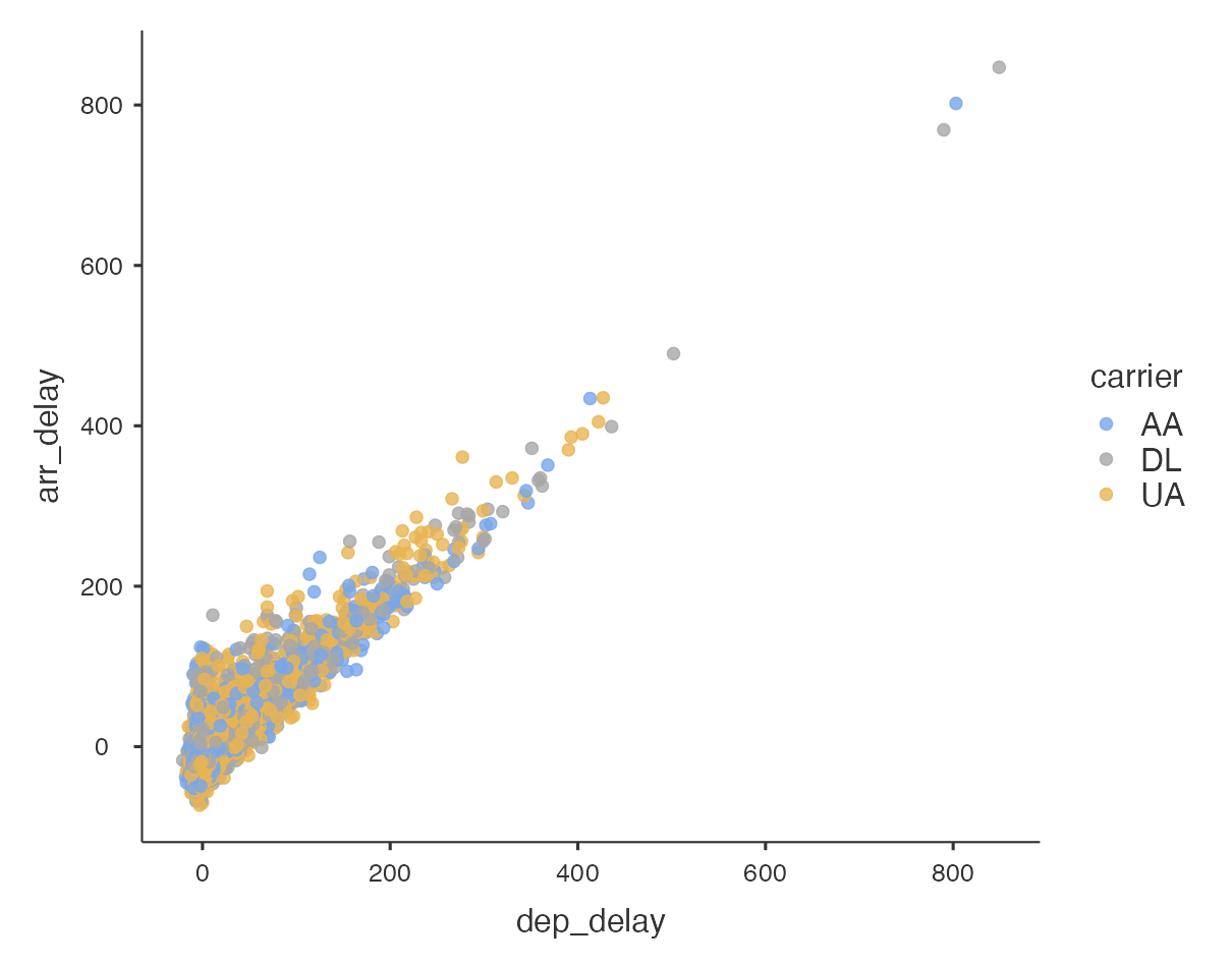
Figure 5: jamovi Scatterplot of arr_delay variable vs dep_delay variable split by origin variable [Long Description]
Long Descriptions
- Figure 1: Jamovi histogram of dep_delay variable filtered to only have flights headed into LAX in March. The histogram has a right-sqewed format with peak in the second category and trailing off to higher values of dep_delay. [Back to Figure 1]
- Figure 2: Jamovi boxplot of dep_delay variable filtered to only have flights headed into LAX in March. Boxplot is showing vertically with scale of 0, 50, 100, 150. The zero value is not at bottom of axis but higher. Boxplot does not have values directly labelled. Values described come from descriptive statistics listed above the box plot. [Back to Figure 2]
- Figure 3: Jamovi histogram of the calculated avg_speed variable from the nycflights data set showing approximately symmetric shape. [Back to Figure 3]
- Figure 5: Jamovi screen shot of a scatter plot with variable dep_delay on X-axis and arr_delay on Y-axis. X-axis scale is 0 to 800 by increments of 200 and Y-axis has scale 0 to 800 by increments 200. There is a legend with title carrier with three labelled dots. Blue dot for AA, grey dot for DL and yellow dot for UA. The plotted dots clump closely together following an approximately 45 degree line with no dots below the implied line and a spread of dots above. The majority of dots are have both X and Y values below 200. Close to 99% of the data have X and Y values below 400. There are 4 outliers with the most extreme 3 having X and Y values of 800 or slightly higher. [Back to Figure 5]
