Lesson 2.3: The Normal Distribution
Software Lab 2.3 Solutions
- Use filter
restaurant=="Mcdonalds" or restaurant=="Taco Bell". The mean is higher for McDonald’s compared to Taco Bell (286 vs 188), as is the median (240 vs. 180). The distribution shapes are skewed right with a small number of high extreme values for McDonald’s and roughly symmetric and bell-shaped or normal for Taco Bell. The standard deviation is a lot higher for McDonald’s compared to Taco Bell (221 vs. 85), while the values for McDonald’s range from 50 to 1,270 and for Taco Bell range from 35 to 380.
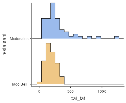
Figure 1: Histograms for cal_fat data set 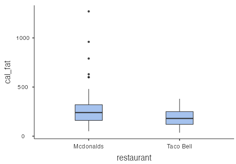
Figure 2: Box plots for cal_fat data set - The normal probability plot for the simulated data is visually similar to the normal probability plot for the real data with points that tend to follow the line other than a few errant points. Since the simulated data are randomly generated, your plot won’t look exactly like this (Fig. 3), but it should be similar:
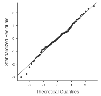
Figure 3: Normal probability plot for sim_norm data set - You should find that the normal probability plot for the real Taco Bell data looks similar to the plots created for the simulated data; i.e., there is graphical evidence that the Taco Bell calories from fat are approximately normal.
- The calories from fat for the McDonald’s menu do not appear to come from a normal distribution since the points in the normal probability plot do not follow the line at all (Fig 4):
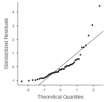
Figure 4: Normal probability plot for McDonald’s data - The probability that a randomly chosen Taco Bell product has more than 300 calories from fat is 0.093 using the theoretical normal distribution, and 0.122 using the empirical distribution.
- Based on the normal distribution, 25% of Taco Bell products have more than 245 calories from fat.
- Burger King’s products are the closest to normal for sodium since the histogram (Fig. 5) is roughly symmetric, bell-shaped, and the points in the normal probability plot (Fig. 6) follow the diagonal line fairly closely.
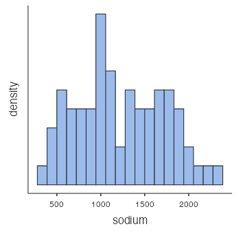
Figure 5: Histogram of sodium in Burger King food 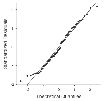
Figure 6: Normal probability plot for sodium in Burger King food - Based on the normal distribution, the probability that a randomly chosen Burger King product has less than 700 mg of sodium is 0.147. Use R code:
round(pnorm(700, mean=1224, sd=500), 3). - Based on the normal distribution, 25% of Burger King products have less than 887 mg of sodium. Use R code:
round(qnorm(0.25, mean=1224, sd=500), 1). - The normal probability plot (Fig. 7) for the total carbohydrates for Subway products likely has a “stepwise” pattern because there are three broad categories of Subway products: foot long subs, 6 inch subs and salads, and other items. Each category has broadly similar total carbohydrates.
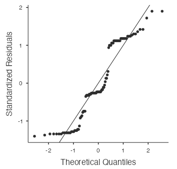
Figure 7: Normal probability plot for total carbohydrates in Subway products The histogram (Fig. 8) confirms these groupings:
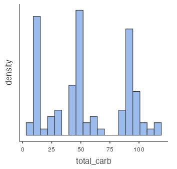
Figure 8: Histogram of total carbohydrates in Subway products
