Lesson 6.2: Simple Linear Regression
Supplementary Notes 6.2
Linear Regression Model
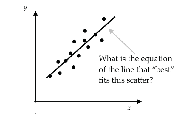
In Lesson 6.1, we measured the strength of a linear relationship for a scatter of points that was linear in form. In this lesson, we go further and develop methods for finding an equation for the line that “best” fits the scatter. We’ll then use this line as a model (called the linear model) to predict values of the response variable (y) from values of the explanatory variable (x). The linear model in this context is also known as a Least Squares Regression model or a Simple Linear Regression (SLR) model.
Least Squares Interpretation of “Best Fit”
In a real-life statistical application, the data points in the scatterplot will seldom, if ever, line-up perfectly along a straight line. So, the question becomes: How should we choose the line through the scatter that in some sense fits the data best?
The least-squares criterion is the method most used for choosing the best fitting straight line. The least-squares criterion says to choose the line that makes the sum of the squared residuals as small as possible. A residual is just the difference between the observed y-value (y) and the corresponding predicted y-value ( , (pronounced “y-hat”) on the line.
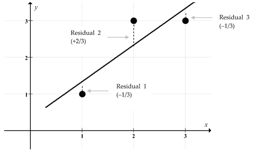
For the simple three-point scatterplot in Figure 2, the least squares criterion says to choose the line that makes (Residual 1)2 + (Residual 2)2 + (Residual 3)2 as small as possible.
In symbols, the least squares criterion says to choose the values of b0 and b1 for the equation  (called the least squares line) that makes
  as small as possible.
Statistical software like jamovi can automatically calculate the y-intercept, b0, and the slope, b1, for the least squares line as illustrated in the following example.
Example: Find the Least Squares Regression Line Using jamovi
When the least squares criterion is used to determine the line of best fit through a scatter of points, the line is usually called the regression line (for historical reasons).
With jamovi, it is easy to find the equation of the regression line for a dataset like the data on used Toyota Corollas we considered in Supplementary Notes 6.1.
- Download the data from corolla [CSV file] and open it in jamovi.
- Select the
Datatab and double-click the header for each variable column to change theMeasure typefor each of the variables fromNominaltoContinuous. - Select
Analyses > Regression > Linear Regression. - Move
priceto theDependent Variablebox. - Move
ageto theCovariatesbox.
The jamovi software returns the following output (Fig. 3) along with additional output we’ll consider later:
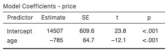
The numbers in the “Estimate” column gives us the y-intercept and slope for the regression line for the Corolla dataset:  .
.
This regression line gives us a predicted price of a ten-year-old Corolla as  .
.
There is some rounding error in this calculation, which we can avoid by using jamovi to predict the price directly. In the Linear Regression dialog, click Save and select Predicted values. Then click the Data tab to find the predicted price of a ten-year-old Corolla to be $6655.595 (without rounding error).
The one ten-year-old Corolla in the dataset has a price of $7300, so the regression line is predicting a slightly lower price. Perhaps this suggests that the price for this Corolla is a little higher than for a typical ten-year-old Corolla in this market.
For a seven-year-old Corolla, the regression line predicted price is  . To find the predicted price without rounding error, go to the
 Data tab and type “7” into the first empty cell for the age variable. Then jamovi should fill-in the predicted price in the corresponding cell for the Predicted values column: $9011.143.
Drawing the Regression Line Using jamovi
- Select
Analyses > Exploration > scatr > Scatterplot. - Move the variable
ageto theX-Axisbox andpriceto theY-Axisbox. - Under
Regression LineselectLinear.
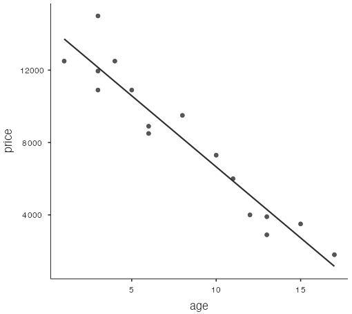
The jamovi software draws a scatterplot with age along the x-axis and price along the y-axis, and the regression line drawn through the point cloud:
Interpreting the Slope and y-Intercept of the Regression Line
What does the slope of the regression line tell us?
The slope of the regression line tells us how much the y-variable changes (on average) for a one-unit increase in the x-variable. The units for the slope are “y-units per x-units.”
In the Corolla example, the regression line model is .
The slope of –785 “dollars per year” tells us that the price of a used Toyota Corolla drops $785 (on average) for each additional year of age for vehicles aged between one and 17 years. Of course, the $785 decrease in price per year is not a certainty. It is just a reasonable prediction obtained from the regression model.
What does the y-intercept of the regression line tell us?
The y-intercept of the regression line gives us the predicted value of the y-variable corresponding to an x-variable value of 0. But we must be careful here since in a particular application, a value of x = 0 may fall outside the x-value data range, and we shouldn’t use the regression line to make predictions outside the x-value data range.
In the Corolla example, the y-intercept is $14,507 and would represent the predicted price of a new Corolla. But notice that the Corolla dataset started at x = 1, so a prediction at x = 0 is extrapolating outside the x-values of the dataset. This is a questionable prediction since the relationship between price and age may be different for new Corollas.
An example of a more extreme invalid extrapolation would be to use the regression line to predict the price of a 20-year-old Corolla:  .
.
Clearly the negative predicted price of –$1193 is absurd (and very insulting for owners of fine 20-year-old Corollas!).
For the Corolla data, the regression model was built for ages (x-values) between one year and 17 years. Using this model to predict prices for ages outside this interval is risky (and likely inappropriate).
Finding the Least Squares Regression Line by Hand
In practice, statistical software like jamovi is used to find the equation of the regression line, but hand calculation using the least squares formulas for the slope and y-intercept can give us some insight into how the regression line works.
- Least Squares Regression Line: .
- Slope:
 .
. - y-Intercept:
 .
.
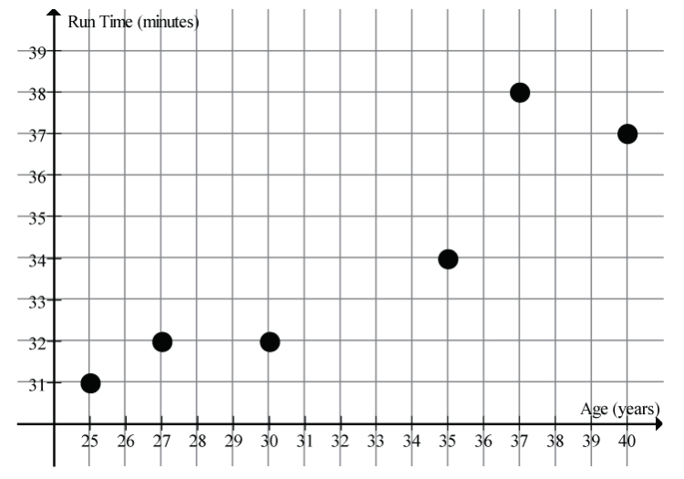
Example: Run Time by Age
The scatter in Figure 5 suggests a linear relationship between the age of a female athlete and the time to run 10 km.
Here are the summary statistics for this dataset:
- Age mean:
 years
years - Age SD:
 years
years - Run time mean:
 mins
mins - Run time SD:
 mins
mins - Correlation:

Given the above summary statistics, it is easy to find the equation of the regression line.
- Slope:

- y-Intercept:

- Regression Line Equation:

This regression line model predicts that the 10 km run time for female athletes in this age range increases on average by 0.45 minutes for each year of age (between 25 and 40 years old). In this example, the y-intercept has no natural meaning since it is ridiculous to predict a run time for an athlete of age 0!
Insight into the Least Squares Regression Line
Let’s use this run time by age example (above) to get some insight into the least squares regression line.
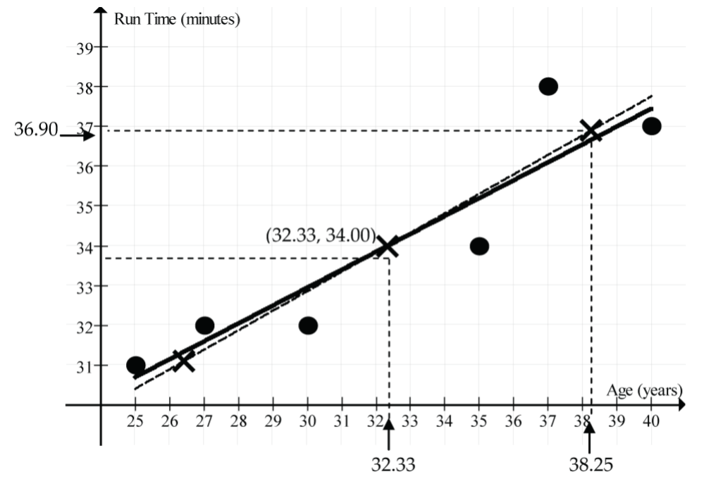
For this example, the regression line is and its graph is shown as the solid line in the scatterplot (Fig. 6). Notice that it goes through the point (32.33, 34.00).
What’s special about this point?
Look back at the summary statistics to see that 32.33 is the mean age,  , and 34.00 is the mean run time,
  . The point (32.33, 34.00) = (, ) is called the point of averages. It’s not a fluke that this regression line goes through the point of averages. The least squares regression line will always pass through the point of averages (, ). If you are algebraically inclined, you could prove this!
What else can we learn about the regression line from this example?
It’s tempting to think that if we move 1 SD up from on the x-scale to 38.25 (32.33 + 5.92), the line would go up 1 SD up from on the y-scale to 36.90 (34.00 + 2.90). But does it?
Check it out: at x = 38.25, the regression line predicts a run time of 19.45 + 0.45(38.25) = 36.66 minutes. This is close, but a little less than 36.90 minutes.
Why the discrepancy?
The answer lies in the formula for the slope of the regression line, . It says that for a “run” of  on the x-scale, the predicted y-value “rise” is only r times
  on the y-scale. Since r = 0.92, the predicted vertical rise is slightly less than 1 SD on the y-scale. Since the correlation between the two variables is not perfect, we hedge a little bit when we make predictions away from the point of averages. The dashed line (Fig. 6) represents the perfect correlation (r = 1) line. The regression line (solid black line) is tipped down a little from the dashed line by the factor r (here r = 0.92).
Summary
The least squares regression line always goes through the point of averages. (, ), and for each change on the x-scale, the predicted change on the y-scale is  .
.
“Reading” the Residual Scatterplot
Sometimes it’s hard to say whether it is reasonable to fit a simple linear regression model for a particular dataset represented in a scatterplot. In many cases, the regression line is first calculated, and then a new scatterplot is created for the residuals. This new residual scatterplot is then used to determine whether the linear model assumptions are appropriate. For the linear model assumptions to be appropriate, the residual scatterplot should have no pattern at all to it. If it does have a pattern, then the linear model assumptions are questionable. Remember that the residuals are calculated as residual = observed y-value − predicted y-value =  .
.
Here’s how to draw a residual scatterplot using jamovi for the used Toyota Corolla dataset.
Drawing a Residual Scatterplot Using jamovi
In the Linear Regression dialog, click Assumption Checks and select Residual plots. The jamovi software creates three scatterplots:
- Residuals on the vertical axis and fitted values (predicted values) on the horizontal axis (Fig. 7).
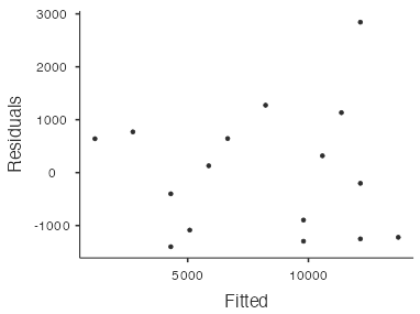
Figure 7: Residual scatterplot for used Toyota Corollas - Residuals on the vertical axis and the response variable (
price) on the horizontal axis. Note: Ignore this plot; it is not relevant! - Residuals on the vertical axis and the predictor variable (
age) on the horizontal axis (Fig. 8).
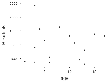
Figure 8: Residual scatterplot for used Toyota Corollas
The first (Fig. 7) and third (Fig. 8) residual plots produced by jamovi convey the same information since the fitted values are directly proportional to the predictor variable (age). So, in practice we only need to look at one of these residual plots for simple linear regression. For example, the residual scatterplot in Figure 8 with age on the horizontal axis is not strongly showing any apparent pattern, so the linear model seems appropriate for this dataset. There is one point with a residual close to 3,000, which lies a little way away from the other points. However, it’s not so far away as to be particularly worrisome.
Interpreting R2
The appropriateness of using a linear model can be judged by looking at the residual scatterplots as just discussed. But a linear model that is judged appropriate (because the residual scatterplots have no strong patterns) may or may not fit the data well. It all comes down to the amount of variation the data exhibit about the regression line.
How should we measure the strength of the linear model?
Hopefully the correlation coefficient r springs to mind! The correlation coefficient r can certainly be used, but in the regression line context, we usually use the square of r (r2) because it tells us the percentage of the variation in the response variable (y) that has been accounted for by the linear model. Usually, r2 is written as R2 and is expressed as a percentage.
Example: Price of Used Toyota Corollas
You’ve likely already noticed that R2 automatically appears in the output whenever you do a linear regression using jamovi:
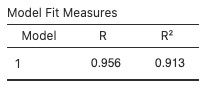
Thus, for the Corolla linear regression, R2 = 0.913 or 91.3%:
This tells us that about 91.3% of the variation in Corolla prices can be explained, or is accounted for, by the linear model taking the age of the car into account. Said another way, differences in the age of the car account for about 91.3% of the variation in the prices. Given the lack of strong patterns in the residual scatterplot and the relatively high value of R2, the linear model strongly fits this dataset.
Example: Run Time by Age
For the run time example, R2 = 0.8475 or 84.75%. About 84.75% of the variation in the run times is accounted for by the linear model taking age into account. The linear model quite strongly fits this dataset.
Simple Linear Regression With a Categorical Predictor
Up to now, we’ve discussed the Simple Linear Regression (SLR) model in the context of a numerical response variable (y) and a numerical explanatory (or predictor) variable (x). It is also possible to incorporate a categorical predictor variable by using a “binary indicator variable.” Section 8.2.8 in the textbook works through an example of SLR with a categorical predictor.
Common Pitfalls in Linear Regression
So far, we have focussed on the mechanics of linear regression. Computers make the mechanics of finding the regression line equation for a given dataset a relatively simple task.
Computers have been programmed to find this “best fitting” linear model (in the least-squares sense) for the data, but is this model of any value? Hopefully it is, but it’s wrong to automatically assume that it is. There are circumstances where the “best fitting” linear model is at best misleading and at worst totally inappropriate.
The tricky job of correctly using and interpreting the calculated regression line requires a little regression “wisdom.”
Here’s a summary of the important “regression wisdom” topics and pitfalls to be familiar with:
- Pattern changes
- Extrapolation
- Summary value regressions
- Causation
- Non-linear models
- Outliers
- High leverage points
- Influential points
There are no new formulas or calculations for these topics, but to acquire the desired level of “regression wisdom,” it’s important to carefully go through the examples and exercises both here and in the textbook.
Pattern Changes in Scatterplots
Consider doing a correlation and regression line calculation for the BC birth rate data in Table 1:
| Year | BC Live Births per 1,000 population |
Year | BC Live Births per 1,000 population |
Year | BC Live Births per 1,000 population |
| 1950 | 23.85 | 1968 | 16.82 | 1986 | 13.88 |
| 1951 | 24.10 | 1969 | 17.18 | 1987 | 13.64 |
| 1952 | 24.75 | 1970 | 17.32 | 1988 | 13.75 |
| 1953 | 25.44 | 1971 | 15.95 | 1989 | 13.63 |
| 1954 | 25.44 | 1972 | 15.42 | 1990 | 13.78 |
| 1955 | 25.44 | 1973 | 14.92 | 1991 | 13.44 |
| 1956 | 25.91 | 1974 | 14.92 | 1992 | 13.27 |
| 1957 | 26.14 | 1975 | 14.91 | 1993 | 12.87 |
| 1958 | 25.73 | 1976 | 14.53 | 1994 | 12.72 |
| 1959 | 25.51 | 1977 | 14.71 | 1995 | 12.34 |
| 1960 | 25.04 | 1978 | 14.72 | 1996 | 11.84 |
| 1961 | 23.69 | 1979 | 14.95 | 1997 | 11.21 |
| 1962 | 22.97 | 1980 | 15.19 | 1998 | 10.72 |
| 1963 | 22.06 | 1981 | 15.19 | 1999 | 10.36 |
| 1964 | 20.57 | 1982 | 15.40 | 2000 | 9.97 |
| 1965 | 18.74 | 1983 | 15.30 | 2001 | 9.90 |
| 1966 | 17.35 | 1984 | 15.47 | 2002 | 9.70 |
| 1967 | 16.91 | 1985 | 14.38 | 2003 | 9.72 |
| Data source: (British Columbia Vital Statistics Agency, 2003) | |||||
- Regression line:

- Correlation: r = 0.9404
- R2 = 0.8844
Looking only at the relatively high values for the correlation coefficient and R2, we could be fooled into thinking that the linear model is appropriate for this data. If we then used the regression line to predict the birth rate for the year 2010, we get 627.253 − 0.3088(2010) ≈ 6.57 live births per 1,000 population. This prediction seems a little on the low side.
Why should we be sceptical about the accuracy of this prediction?
- We have jumped into a linear regression calculation without first looking at the scatterplot to see if the linear model is appropriate.
- The year 2010 is outside our dataset, so we are extrapolating. Risky!
Figure 11 shows the scatterplot for this data.
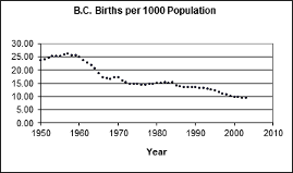
What patterns do we see in the scatterplot?
There is an overall downward trend to birth rate, but there are many sub-patterns in this dataset:
- A “baby boom” in the 1950s
- A rapidly falling birth rate through the early 1960s
- A levelling-off in the 1970s through the mid-1980s
- A slow downward trend beginning around 1985
- A possible levelling-off in the 2000s
The scatterplot tells the story. A single overall linear model is not reasonable for this dataset: Each sub-era should get its own model.
So, what was the actual live birth rate for 2010?
It was 9.64, barely less than in 2003, and much higher than the value we got from the linear model (6.57, see the calculation above), based on data from 1950–2003.
Risks of Extrapolation
For many datasets, it’s natural to want to make predictions for x-values outside the actual x-interval of the dataset. Such predictions are called extrapolations. Extrapolations can be risky. Why? The basic risk is that there could be a fundamental change in the model as we move outside the x-interval of our dataset.
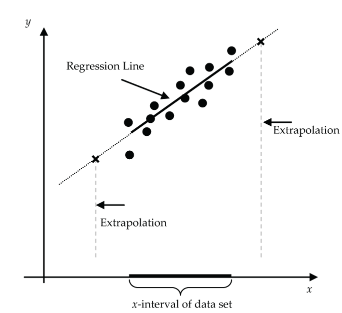
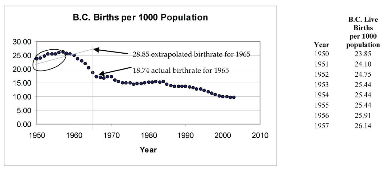
For example, suppose for the BC birth rate data someone back in 1957 tried to predict the birthrate for 1965 using a regression line based on the 1950 to 1957 birthrate data. The scatterplot for the 1950 to 1957 data suggests that a linear model for this time interval is appropriate.
- Regression line (1950 to 1957):

- Correlation: r = 0.9601
- R2 = 0.9217
Using this line to predict the birthrate for 1965 gives -606.265 + 0.3232(1965) ≈ 28.82 live births per 1,000 population. Of course, this extrapolated prediction is way off the actual 1965 birthrate of 18.74 because, as history shows, the baby boom sharply declined in the early 1960s.
Now, to predict BC’s birthrate in year 2010, what model should we use?
There is no right or wrong answer here, but one reasonable approach would be to use the data from year 2000 onward. This gives 199.965 − 0.095(2010) ≈ 9.015 live births per 1,000 population as an extrapolated estimate. Seems plausible, and not far off the actual value of 9.64!
Regression on Summary Data
Here’s a nicely “cooked” example designed to exaggerate the potentially misleading conclusions from a regression on summary data.
“Raw” Data
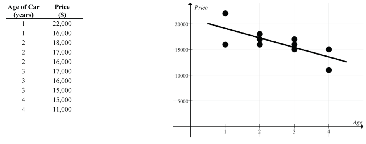
- Regression line:

- Strength of the linear relationship: r ≈ – 0.73 and R2 ≈ 0.53
“Summary” Data
Now let’s redo this linear regression using the mean price for each of the four ages (instead of the individual car prices).
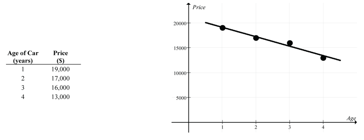
- Regression line:

- Strength of the linear relationship: r ≈ – 0.98 and R2 ≈ 0.96
The two regression lines are very similar, but there is a considerable difference in the implied strength of the linear relationship (a moderately strong linear relationship, r ≈ – 0.73, for the regression on the individual car prices vs. an almost perfect linear relationship, r ≈ – 0.98, for the regression on the mean car prices).
So, what is the issue?
Be wary of claims about strong linear relationships based on regressions on group means. The reduced variability of group means typically inflates the strength of the linear relationship since it ignores the variability of individual measurements.
Risk of Interpreting Linear Models as Causal
When regression analysis reveals a strong linear relationship between two variables, it is very tempting to interpret the relationship as causal. However tempting, it is wrong to conclude that changes in the explanatory variable (x) are causing changes in the response variable (y) from the regression analysis alone.
Sometimes a causal interpretation is valid and clear from our understanding of the variables and the design of the study. For example:
- x = number of alcoholic drinks consumed by a person
- y = blood alcohol level of the person
Clearly, increasing the value of x causes an increase in the value of y.
Sometimes the causal interpretation is obviously wrong because it is clear that x and y are simply responding to another variable, called a lurking variable, that is not explicitly controlled for in the study. Remember this example from Supplementary Notes 6.1?
- x = summertime daily number of visitors to Vancouver’s beaches
- y = summertime daily volume of water drawn from Vancouver’s reservoirs
Here, it was clearly absurd to conclude a causal relationship because it was obvious that these two variables are each responding to a lurking variable: summertime daily temperature. Hot days cause higher values of both x and y, and cool days cause lower values of both x and y.
However, in many cases a discovered linear relationship between two variables is simply a starting point that leads to follow-up studies that have been properly designed to reveal whether the relationship is causal. In Lesson 1.2, we explored some of the techniques and issues related to designing experiments that can lead to valid causal conclusions. For example:
- x = daily dosage level of some herbal extract
- y = number of colds a person gets in a year
If the study data was collected from people who had decided on their own to try the herbal extract and who set their own dosage level, it would be wrong to conclude a causal relationship. We identified this type of study as an observational study.
However, if the study was designed in such a way that the researcher initially randomly assigned subjects to different dosage levels, a causal conclusion is possible (subject to other experimental design issues being met). We identified this type of study as an experimental study.
Possible Effects of Outliers
In statistical analyses, outlier or unusual points are always a concern because of the possibility that they can unduly distort the analysis. In regression analysis the effect of these points is very sneaky. Sometimes they produce dramatic changes in the proposed linear model; other times they don’t. In fact, in some cases they actually appear to strengthen the model!
The following terminology helps us characterize these unusual points.
- Outlier point: A data point that stands apart from the rest of the point cloud in the scatterplot.
- High leverage: A data point has “high leverage” if it has an x-value that is far away from the mean of the x-values.
- Influential: A data point is “influential” if the slope of the regression line model changes considerably depending on whether the point is included or excluded from the analysis.
The following example provides a concrete feel for how individual points can affect the linear model. As we go through the various cases, confirm the regression and correlation results using jamovi.
Example: Understanding Outliers
For this small dataset of four points, we get the following linear model results:
- Download outliers [CSV file] and open the data in jamovi.
- Go to the
Datatab and double-click the column headers to change the variable measure types toContinuous. - Select
Analyses > Exploration > scatr > Scatterplot, movextoX-axis, moveytoY-axis, and underRegression LineselectLinear. - Select
Analyses > Regression > Linear Regression, moveytoDependent Variable, movextoCovariates, and underSaveselectResiduals. - Regression line:

- Correlation: r = 0.316
- Point of averages: (3, 4) since
 and
and 
Now let’s explore the effect on the linear model results by adding a fifth point to the dataset. Try to anticipate the effect of each alternative fifth point before actually reading the discussion and going through the calculations.
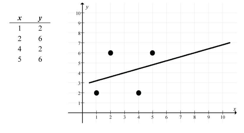
- Add the point (3, 4):
- What’s special about the point (3, 4)? It is the point of averages for the original scatter.
- Go to the
Datatab and type “3” in the first empty cell in the “x” column and type “4” in the first empty cell in the “y” column. - The scatterplot with fitted regression line and the regression model results should automatically update.
- New regression line:
- New correlation: r = 0.316
- New point of averages: (3, 4)
 and
and 
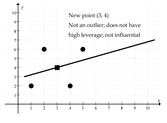
Figure 17: The new point (3, 4) (shown as a square) is not an outlier, does not have high leverage, and is not influential; (solid line) regression line. Remember that the original regression line goes through the point of averages (3, 4), and by adding it as a data point, there is no change to the point of averages, the regression line, or the correlation. The size of the residual for this new point is 0 since it is right on the new (and old) regression line.
- Add the point (8, 6):
- What’s special about the point (8, 6)? It’s an unusual point in that the x value of this point is considerably larger than the mean of the x values. However, it is perfectly consistent with the original linear model since the original regression line passes through the point (8, 6).
- Go to the
Datatab and change the fifth data point to “8” for “x” and “6” for “y.” - The scatterplot with fitted regression line and the regression model results should automatically update.
- New regression line:
- New correlation: r = 0.5
- New point of averages: (4, 4.4)
 and
and 
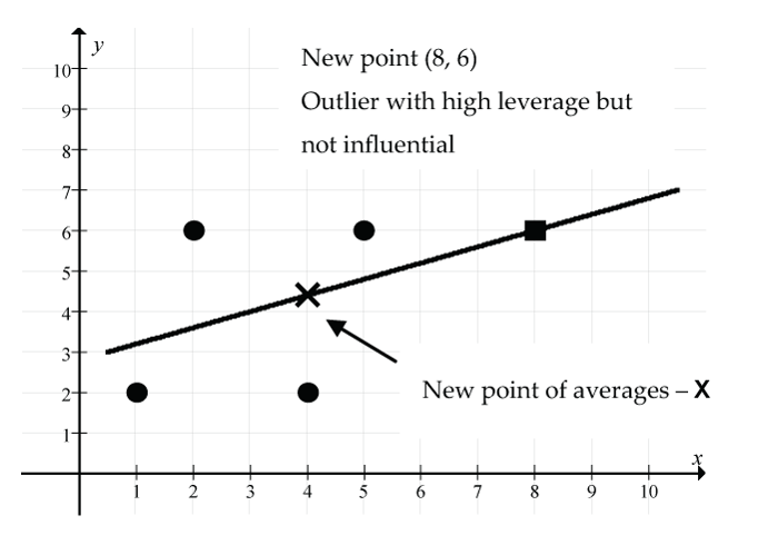
Figure 18: The new point (8, 6) (shown as a square) is an outlier with high leverage but it is not influential: (solid line) regression line, (X) new point of averages. There is no change to the regression line model since the new point (8, 6) and the new point of averages (4, 4.4) fall exactly on the old regression line. However, the correlation coefficient has increased from r = 0.316 to r = 0.5. Based on the increase in r, this one new point seemingly has strengthened the linear relationship considerably. The size of the residual for this new point is 0 since it is right on the new (and old) regression line.
- Add the point (10, 7):
- What’s special about the point (10, 7)? It’s an unusual point in that the x value of this point is considerably larger than the mean of the x values. However, it is consistent with the original linear model since the original regression line passes close to the point (10, 7).
- Go to the
Datatab and change the fifth data point to “10” for “x” and “7” for “y.” - The scatterplot with fitted regression line and the regression model results should automatically update.
- New regression line:

- New correlation: r = 0.616
- New point of averages: (4.4, 4.6)
 and
and 
Figure 19: The new point (10, 7) (shown as a square) is an outlier with high leverage but it is not influential: (solid line) new regression line, (dash line) old regression line, (X) new point of averages. There is little change to the regression line model since the new point (10, 7) and the new point of averages (4.4, 4.6) are both nearly on the old regression line. However, the correlation coefficient has increased dramatically from r = 0.316 to r = 0.616. Based on the increase in r, this one new point seemingly has strengthened the linear relationship considerably. The size of the residual for this new point is small (0.033) since it is just above the new regression line.
- Add the point (3, 8):
- What’s special about the point (3, 8)? It’s an unusual point in that the y value of this point is considerably larger than the mean of the y values, although the x value is right on the mean of the x values.
- Go to the
Datatab and change the fifth data point to “3” for “x” and “8” for “y.” - The scatterplot with fitted regression line and the regression model results should automatically update.
- New regression line:

- New correlation: r = 0.236
- New point of averages: (3, 4.8)
 and
and 
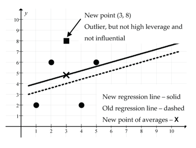
Figure 20: The new point (3, 8) (shown as a square) is an outlier, not high leverage and not influential: (solid line) new regression line is above (dash line) old regression line, (X) new point of averages. The point (3, 8) has “pulled” the regression line model upwards. Why? Remember that the regression line always goes through the point of averages, and the new point of averages is (3, 4.8), which is directly above the old point of averages (3, 4). The slope of the line remains unchanged. The correlation coefficient has decreased from r = 0.316 to r = 0.236, indicating a weaker linear relationship. The size of the residual for this new point is large (8 − 4.8 = 3.2), indicating that it is well above the new regression line.
- Add the point (1, 7):
- What’s special about the point (1, 7)? It’s an unusual point in that the x value of this point is somewhat below the mean of the x values, and the y value is well above the mean of the y values.
- Go to the
Datatab and change the fifth data point to “1” for “x” and “7” for “y.” - The scatterplot with fitted regression line and the regression model results should automatically update.
- New regression line:

- New correlation: r = –0.0457 (it must be negative because the slope of the line is negative).
- New point of averages: (2.6, 4.6)
 and
and
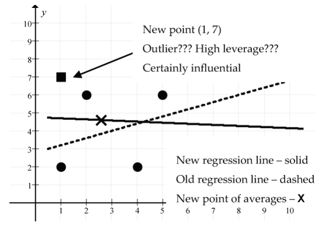
Figure 21: The new point (1, 7) (shown as square), (solid line) new regression line, (dash line) old regression line, (X) new point of averages. The point (1, 7) has produced a dramatic change in the regression line model, tipping it downwards since the new point of averages (2.6, 4.6) is higher and to the left of the old point of averages (3, 4). Remember that the new regression line is supposed to fit the new scatter as well as it possibly can, plus it must go through the new point of averages. The correlation coefficient has decreased from r = 0.316 to r = –0.0457, indicating a very weak negative linear relationship. The size of the residual for this new point is moderately large (7 − 4.7 = 2.3), indicating that it is above the new regression line.
- Add the point (8, 9):
- What’s special about the point (8, 9)? It’s an unusual point in that both the x and y values of this point are considerably larger than the respective means of the dataset.
- Go to the
Datatab and change the fifth data point to “8” for “x” and “9” for “y.” - The scatterplot with fitted regression line and the regression model results should automatically update.
- New regression line:

- New correlation: r = 0.730
- New point of averages: (4, 5) and

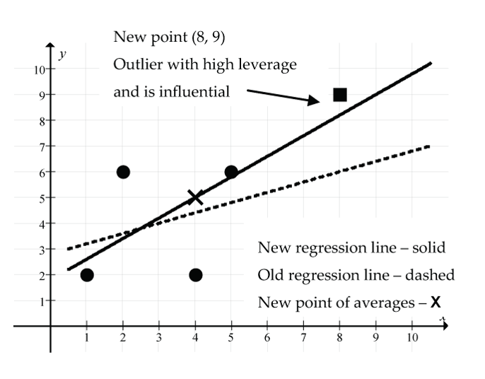
Figure 22: The new point (8, 9) (shown as square) is an outlier with high leverage and influence: (solid line) new regression line, (dash line) old regression line, (X) new point of averages. The point (8, 9) has produced a considerable change in the regression line model, tipping it upwards since it must pass through the new point of averages (4, 5). The correlation coefficient has increased dramatically from r = 0.316 to r = 0.730, indicating a moderately strong linear relationship. The size of the residual for this new point is quite small (9 − 8.2 = 0.8), indicating that it is just above the new regression line.
- Add the point (10, 0):
- What’s special about the point (10, 0)? It’s an unusual point in that the x value is unusually large, and the y value is unusually small relative to the respective means of the dataset.
- Go to the
Datatab and change the fifth data point to “8” for “x” and “6” for “y.” - The scatterplot with fitted regression line and the regression model results should automatically update.
- New regression line:

- New correlation: r = –0.489
- New point of averages: (4.4, 3.2) and

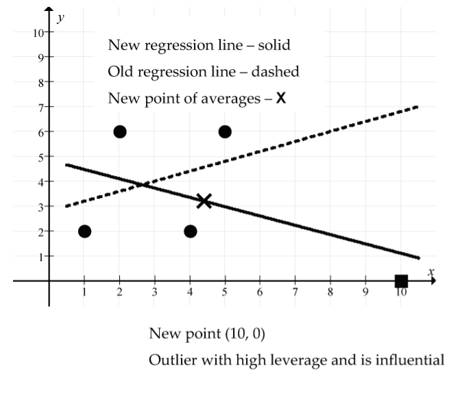
Figure 23: The new point (10, 0) (shown as square) is an outlier with high leverage and influence: (solid line) new regression line, (dash line) old regression line, (X) new point of averages. The point (10, 0) has produced a very dramatic change in the regression line model, tipping it downwards since it must pass through the new point of averages (4.4, 3.2). The correlation coefficient has changed dramatically from r = 0.316 to r = – 0.489, indicating a moderate negative linear relationship. The size of the residual for this new point is quite small (0 − 1.106 = –1.106), indicating that it is below the new regression line.
This example has given us a feel for how unusual points can affect the regression line and correlation coefficient. Keep in mind, though, that this example was based on a very small dataset. With small datasets, unusual points can have a much more pronounced effect on the model than with large datasets.
The following graphs (Fig. 24) summarize the main ideas and terminology.
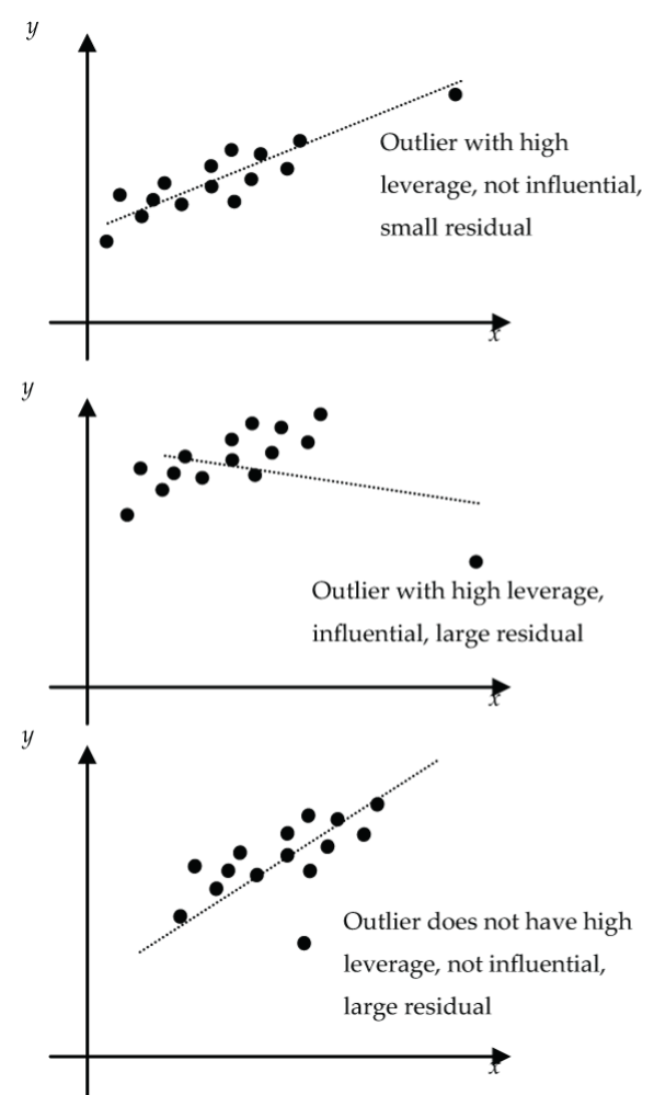
Summary
When we detect unusual points in a regression analysis, we should run the analysis both with, and without, these unusual points. The subsequent discussion of the linear model should include comments about these unusual points and how these points affect the model:
- Did the slope change much?
- Did the y-intercept change much?
- Did the correlation coefficient change much?
- Do these points have large or small residuals?
References
British Columbia Vital Statistics Agency. (2003). Selected vital statistics and health status indicators annual report 2003. Ministry of Health Services, Government of British Columbia. http://www.vs.gov.bc.ca/stats/annual/2003/index.html
