Lesson 6.1: Linear Association Between Two Numerical Variables
Lesson Learning Objectives
- Draw a scatterplot using statistical software.
- Interpret the features of a scatterplot.
- Understand the distinction between an explanatory (or predictor) variable and a response variable.
- Use statistical software to calculate the correlation coefficient.
- Understand how the correlation coefficient measures the strength of the linear relationship between two variables.
- Know the basic properties of the correlation coefficient.
Lesson 6.1 Checklist
| Learning activity | Graded? | Estimated time |
|---|---|---|
| Read OpenIntro Statistics section 8.1 and supplementary notes | No | 30 mins |
| Watch instructional video | No | 5 mins |
| Answer two section check-in questions | Yes | 15 mins |
| Work through virtual statistical software lab | No | 45 mins |
| Answer two virtual statistical software lab questions | Yes | 15 mins |
| Work on practice exercises | No | 1.5 hours |
| Explore suggested websites | No | 15 mins |
Learning Activities
Readings 📖 and Instructional Video 🎦
Scatterplots and Correlation
Read Section 8.1: Fitting a Line, Residuals, and Correlation in OpenIntro Statistics (Diez et al., 2019) CC BY-SA 3.0. The best way to describe how two numerical variables vary together is to create a scatterplot, a statistical graph we first looked at in Lesson 1.3. If there is a linear relationship between the two variables, we can summarize that relationship with a line on the scatterplot and a number called the correlation that measures the strength and direction of that relationship. As you read, look up new terminology in the Glossary and self-assess your understanding by attempting the guided practice exercises.
Watch the following video, Line Fitting, Residuals, and Correlation (Barr et al., 2014), on these topics (duration 00:04:04).
So far in this course we’ve analyzed:
- a single categorical variable with two categories (Lesson 4.1);
- a single categorical variable with multiple categories (Lesson 4.2);
- two categorical variables with multiple categories (Lesson 4.3);
- a single numerical variable (Lesson 5.1);
- a numerical response variable and a categorical explanatory variable with two categories (Lesson 5.2); and,
- a numerical response variable and a categorical explanatory variable with multiple categories (Lesson 5.3).
In this unit, we analyze a numerical response variable and a numerical explanatory variable (this lesson and Lesson 6.2). Then in Lesson 6.3 we introduce a model that can analyze a numerical response variable and multiple explanatory variables, both numerical and categorical.
Scatterplots, Linear Relationships, and Correlation
Read Supplementary Notes 6.1, which discusses scatterplots and correlation.
Lesson Check-in Questions ✍
Virtual Statistical Software Lab 💻
Work through the virtual statistical software lab: Software Lab 6.1. In this lab you’ll work with an interesting dataset on student evaluations of professors and explore the relationships between different pairs of numerical variables. As you work through the lab, answer the exercises in the shaded boxes. These exercises are not graded but the solutions are available: Software Lab 6.1 Solutions. The lab should take you no more than 45 minutes to complete.
Virtual Statistical Software Lab Questions ✍
Practice Exercises 🖊
Work on the following exercises in OpenIntro Statistics: Exercises 8.1, 8.3, 8.5, 8.7, 8.9, 8.11, 8.13, and 8.15, and Chapter Exercises 8.37 and 8.43 (Diez et al., 2019) CC BY-SA 3.0. Check your answers using these solutions (Diez et al., 2019) CC BY-SA 3.0. You’ll deepen your understanding much more effectively if you genuinely attempt the questions by yourself before checking the solutions.
Work on the WeBWorK exercises, which are linked from your Moodle course. Check your answers using the solutions provided.
Suggested Websites 🌎
- Do you want to improve your ability to assess the correlation in a scatterplot just by eyeballing it? Then try Guess the Correlation [Application] (Chance & Chance, 2023). The app creates a scatterplot of two randomly generated numerical variables, and you have to guess the correlation. The app can keep track of your performance if you try this a bunch of times, and it can also be used to calculate the correlation for data that you enter or paste.
- Remember, correlation is not the same as causation. To see some pretty funny examples of correlations that occur purely by chance, check-out this site on Spurious Correlations (Vigen, n.d.) CC BY 4.0. I think my favourite is: The number of letters in the winning word of the Scripps National Spelling Bee correlates with the number of people killed by venomous spiders.
Media Attributions
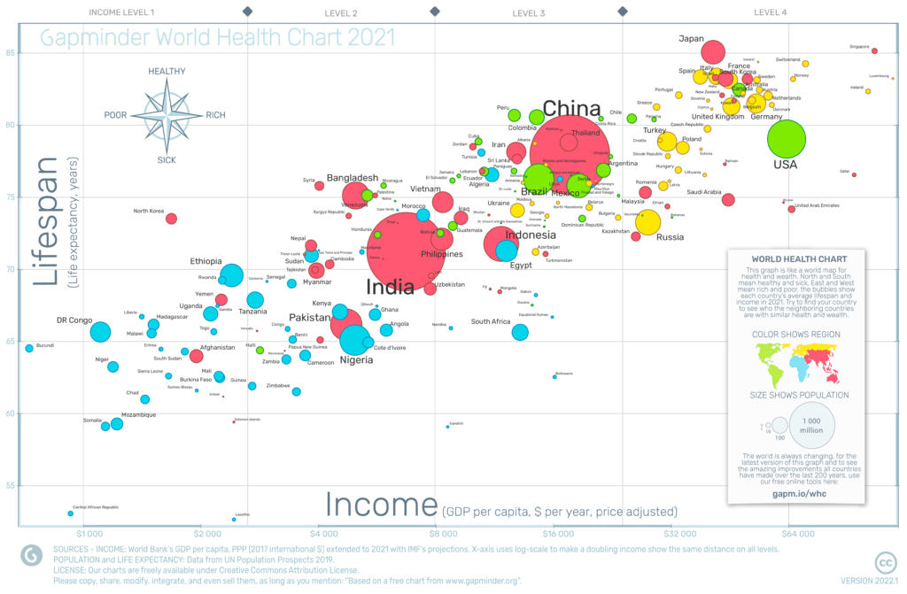
World Health Chart 2021, by Gapminder (n.d.), CC BY 4.0
References
Barr, C., Rico, J., & Diez, D. [OpenIntroOrg]. (2014, Jan. 26). Line fitting, residuals, and correlation [Video]. YouTube. https://www.youtube.com/watch?v=mPvtZhdPBhQ
Chance, B., & Chance, F. (2023. Jul. 29). Guess the correlation [Application]. https://www.rossmanchance.com/applets/2021/guesscorrelation/GuessCorrelation.html
Diez, D. M., Çetinkaya-Rundel, M., Barr, C. D. (2019). OpenIntro Statistics (4th ed.). OpenIntro. https://www.openintro.org/book/os/
Gapminder (2021). Gapminder world health chart 2021 [Image]. Gapminder. https://www.gapminder.org/fw/world-health-chart/whc2021/
Vigen, T. (n.d.). Spurious correlations. https://www.tylervigen.com/spurious-correlations
